ctf_thirdstreet
 HLDM
HLDM
ctf_thirdstreet
by
Alles_Ratten
Posted 8 years ago2016-01-28 00:51:47 UTC •
Completed •
Half-Life: Deathmatch
- Name
- ctf_thirdstreet
- By
-
 Alles_Ratten
 - Type
- Map
- Engine
- Goldsource
- Game
- Half-Life: Deathmatch
- Category
- Completed
- Included
- BSP
- Created
- 8 years ago2016-01-28 00:51:47 UTC
- Updated
- 8 years ago2016-01-28 00:51:47 UTC
- Views
- 2091
- Downloads
- 546
- Comments
- 5
- Rating
- 3.00 (2)
- Reviews
- 0
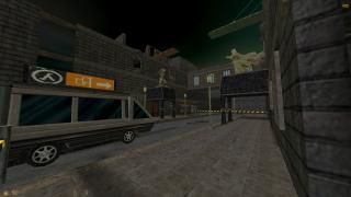
A capture the flag map that i mapped in early 2015 for Half-life deathmatch.
Some of the railings and grids have ladderbrushes attached to their tops so that you can pull up on them. // The balcony above the backyard and the tall grid nearby.
Also the small window close to the beegun (second screen) can be opened, it ill only open to the outside though. All other things are self explanatory.
The models are not mine and found on gamer-lab.com. So unfortunately the authors are unknown...
The map has only ever been tested once. Weapon placement is actually not final and there is another thing that should be fixed for better gameplay, but I dont know if im ever going to edit this map again.
5 Comments
You must log in to post a comment. You can login or register a new account.


From the layout of the map I deduced that it's meant for team deathmatch, the "green" vs "orange" color arrangement suggests this.
There are some inconsistencies, such your attempt to cover the fact that the map is just a cubicle with the T-junction at one end of the street. But it's not long enough and you can see the sky edges. Also, the absence of another T-junction at the other end of the street, or maybe a creatively rounded entrance, is a sign of laziness :P.
Speaking of the illusion of location, you can spend a bit more time adding some additional "buildings" behind the existing ones. They don't need to be very detailed, actually, perhaps just some facades would do. You can afford to do this, I tested the r_speeds on the top of the roof and they don't seem to exceed ~2000 wpolys. With todays computers, I think you can honestly go towards the 4000 wpolys limit for multiplayer. For example, in my dm_researchvessel map I get over 7000 w_polys in some places, but it plays at 60FPS even on my laptop.
Regarding the general aesthetic of the thing, it gives a general impression of good taste and aspiration of an overall theme, with some anomalies. Although I like the fact that it doesn't claim to be rich in fine details, being centered around fast action, some things could have been tuned a bit better. The majority of the textures have a dark tone, but some back alleys are poorly illuminated. I would have spiced up the atmosphere with some more strategically placed lighting fixtures.
Then, you have these gothic statues, which really help set up the identity of the map, but the modern street racing cars in those garages are a harsh contrast.
About the gameplay I can't tell much, it seems to allow a good flow for the player.
All in all, it's a gret map and it deserves some server time!
You know what'd be an unsettling thing? Having another T-junction at the other end, end then creating one or two "cars"(tracktrains) that pass regularly. I don't know why I thought about that, but the contrast of those passing cars with the static nature of the rest of the map would make it creepy :)).
I did plan to make a junction for the other side as well but stopped myself for the sake of better performance and MAYBE laziness.
r_speeds of 2400w/12000e are already a realistic scenario not only on the roof but also on the street.
Unfortunately many HL and AG players don't have modern PC's and are in fact complainig when you get up to 1500 wpoly
You have a badass laptop it seems!
The idea with the car train is cool but I wont bring it into this map, could use it in another one eventually.
The map only has two very randomly placed info_player_deathmatch and the rest is ctf playerspawns (4 on each side) as it is right now
For an experienced player it is very easy to climb up in the backyard and that way also leads directly to the flag. The other 3 ways to the flag all end in one and the same room before you can get to the flag.
Have you thought about the fact that it might also be a good way to escape with the flag?
Generally the railings don't have climb brushes, just the huge gridfence and a part of the free-standing balcony, but thanks for letting me know that my ideas are not great, i never claimed that though.
Low quality mapping hm? haha!
whatever
The map works with the ctf servermod in hldm and most of all with ag where you can start ctf with ag's votesystem. Noone really plays op4
Criticism is totally legit, yours however looks like random bashing to me
I would be very pleased however if you could demonstrate your advanced gameflow in a 1on1 match.