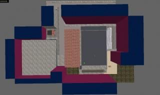
de_stroyschool (Pre-Alpha 9)
 CS
CS
de_stroyschool (Pre-Alpha 9)
by
Admer456
Posted 8 years ago2016-05-14 19:34:21 UTC •
Unfinished •
Counter-Strike
Hello, mappers! I present you one of the biggest maps for Counter-Strike, that is playable. By playable, I mean maps with gameplay elements which make them playable in the terms of gameplay.
It all started as a project for my classmates, and the first version of the map was BAD...
It had no optimization, too much carving, a lot of under-scaled textures, etc. A clutter to work with!
Now I've made a new map from scratch and it's going incredibly fine. And I made special "fake" textures (the pink-ish colour you see on the picture).
You can find the original GameBanana WiP here.
The size of the map in the top view is 7008x4832 units. I could go up to 8192x8192 but that's too big for a map like this...
4 Comments
You must log in to post a comment. You can login or register a new account.


For example, a 8192x128 brush's vertices are basicaly offset -4096 and 4096 units from 0, aren't they? Well, then I have no reason to be afraid of expanding the map even further on the end-of-development phase.
You will easily loose interested to finish things if you publish them like this. No one publushes a empty book with a few head lines, then a book with a few pages and an half drawn title cover, books are published completed, proof read and free of possible errors and mistakes.
If you're building an map first plan it from point 0 to point A from which you can build an steady foundation onto which you can add your composition. Dont just shuffle around different loose foundations that can lead no where in the end.
Plan-phase, Pre-alpha_building, Pre-alpha, Alpha, Pre-beta, Beta, Test Beta, Open Test Beta, Delta, Final and Final HotFix.
You're right. But it's not me. Other people will loose interest about it. It's like watching a 'behind-the-scenes' before the actual movie comes out.
The detail is what blocks me from continuing. See, some places (like the corner between the fence and the sandy part) are made out of details. So, instead of putting 4 brushes for that area I put 12 of them.
But, at least it's better than the old one, which was clearly laggy.