portalia

Half-Life: Deathmatch HLDM
portalia by cetinakyuz
Posted 6 years ago2018-02-14 12:24:25 UTC • Completed • Half-Life: Deathmatch
Loading...
Screenshot Thumbnail
Name
portalia
By
cetinakyuz cetinakyuz
Type
Map
Engine
Goldsource
Game
Half-Life: Deathmatch
Category
Completed
Included
BSP
Created
6 years ago2018-02-14 12:24:25 UTC
Updated
6 years ago2018-03-04 08:55:46 UTC
Views
1844
Downloads
686
Comments
6
Rating
3.50 (2)
Reviews
0
full star full star full star half star empty star Download

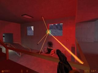
A multiplayer map with portals.

6 Comments

Commented 6 years ago2018-02-16 18:52:58 UTC Comment #4309
really cute minimalist map, but there is some wrong things. i hope my comment will be usefull for you.
  1. those biggest crates are not properly textured, either small metal doors are not too. the textures have been shifted a bit.
  2. freight elevator engines are not textured properly too.
  3. And freight elevator rails are not rail textures, these are "cable tray" textures. HALF-LIFE is a very low-polygon game. So you can add important details to objects only with textures. If you use wrong texture on wrong object, this will affecting much to object details. For example if i use a fan texture to make a car wheel, this situation will break the HALF-LIFE's 3d world illusion. because fans and wheels both only are cylindrical brushes in the game, the only difference is at the texturing. so players' brain will mistake the object, and players will think "why they put the fans to the wheels of this car?". if you claim you used cable tray texture because for the giving impression of elevator cables, then you must add more rails for carrying the load.
  4. the ambiance sound is annoying, and very distracts for me.
  5. sadly i wont be able to try multi player. i dont have any friends to play with. i dont know how fun or not is this map. so i cant comment for playability.
  6. still i think rpg's cage is not good for a multi player game. Because people may always trap that cage with mines and no body can get the rpg ever.
  7. i think beams on that electrical fence is very bad because its not resemble a real lightning, that beams in your map is just a laser beam. Similar to 3rd section of my comment, this miss usage will break the game's illusion.
  8. Lamps are very thick, they look like lightning bricks, make them thinner. you also may add a bit cables to the lamps.
  9. That forklift prefab is very poor, and it is fits to 1st,2nd and 3rd sections of my comment. my brain thinks "Why there is a train in this map shaped just like a forklift?"
  10. rpg's shelf is floating in midair make them a realistic shelf.
  11. rpg's cages door is stays at perfect 90 degree, this is not realistic at all. i hate perfect doors, doors must stay at imperfect angles. and you must add door frame to that door.
  12. thoose yellow lights near to that broken handrail are just like painted to wall, make them a bit different. You may add lightning sockets to make them cool.
  13. You must add structural supports to the ladders, to the stairs, to the ledges, to the ceiling, and to that shelve which is bears gluon gun.
  14. that computer consoles are a bit awkward to be a realistic. maybe you may add some chairs next to those computer desks.
  15. you placed wrong that orange thing by the that metal stair, stair looks like floating in air.
  16. you must make arches more smooth. by the way you must have been read the tutorials about not to making arches with "carve" tool.
  17. that handrail by the freight elevator is not good because there is a small gap beetween two handrails, close that gap. or you may change the handrail design if you dont want to close that gap. with your design handrail is looks very unsatisfying.
  18. i like the idea of that open big crate which is loaded with ammo boxes. but you must make your box with thicker wood. because the side texture of the crate give impression of thicker wood. you must fit your front wood to your side wood texture.
  19. normal elevator's buttons are interfered with elevator's door, place the button on much reasonable place.
  20. you may add bigger pallets to some big crates, or you may add some pallets to this map. or you can add pallets of different loads. i have an idea how about a brand new teleporter unit, or computer unit on the pallet.
  21. my favorite thing in this map is that create near the exit door which has HEV batteries on it. This crate is hard to reach, you may add RPG or another powerful weapon on it.
  22. you may make more realistic place for gauss gun, you may make that place more cool, so maybe it would looks like a ventilation duct.
  23. add more ventilation ducts to your map, to make it more realistic.
  24. that door with eye scanner is not proper. check 3rd section of my comment. The door has a black rectangle on it. my brain thinks why there is a black rectangle on the door. i think the black rectangle means "place a window here" so place a window.
  25. more details like decals would be good.
  26. i think that "processing area 3" decal is not reasonable that much. Write "storage area" instead. processing area i think associated with processing machines. but there arent any machines in this map at all.
  27. i think you must add frames to all windows and doors.
  28. Add more atmosphere, sadly i cant give any advice about this. im lacking at this subject.
  29. half-life has not got dynamic room lightning. so be careful when lighting movable objects. I have checked under your freight elevators' platform, so i think you aware of this situation. but still your elevators' lighting a bit dirty.
  30. few objects like crates, teleporters, computers are everywhare. there is no unique objects. add unique objects. you may add a toolbox next to broken teleporter. or you may add fuel barrel next to a forklift.
Commented 6 years ago2018-02-19 05:32:06 UTC Comment #21273
nice review hfc ^
|
Commented 6 years ago2018-02-19 20:44:54 UTC Comment #21275
uh
five stars?
really?
I mean, I have nothing against the map or the author, but hfc nicely explained why this map deserves no more than 2-3 stars.
have you even played the map?
Commented 6 years ago2018-02-21 12:30:48 UTC Comment #21278
hfc, ur comment is very inspiring. thank u.
guys, i'm working on review critics and more. must i delete this map and upload the new one or keep both maps. what do you think?
Commented 6 years ago2018-02-23 06:03:03 UTC Comment #21281
You may update the current post, unless the new map is a completely new one. If it's just an updated version of this one then there's no need to delete the page.
Though, if the new version drastically differs from this one then you might want to delete this page and upload the new version as a new map to attract more attention to it.
Commented 6 years ago2018-02-23 17:54:04 UTC Comment #21282
i will keep this map and comments as a lesson. thank u.

You must log in to post a comment. You can login or register a new account.