Half-Life: Under Maintenance
 HL
HL
Half-Life: Under Maintenance
by
Ogdred
Posted 5 years ago2019-09-03 01:49:56 UTC •
Unfinished •
Half-Life
- Name
- Half-Life: Under Maintenance
- By
-
 Ogdred
 - Type
- Map
- Engine
- Goldsource
- Game
- Half-Life
- Category
- Unfinished
- Included
- BSP
- Created
- 5 years ago2019-09-03 01:49:56 UTC
- Updated
- 5 years ago2019-10-09 10:56:54 UTC
- Views
- 3550
- Downloads
- 665
- Comments
- 9
Hello peeps,
I am a new member of this here fine website and a new (and hopefully not short-lived) member of the GoldSource mapping community.
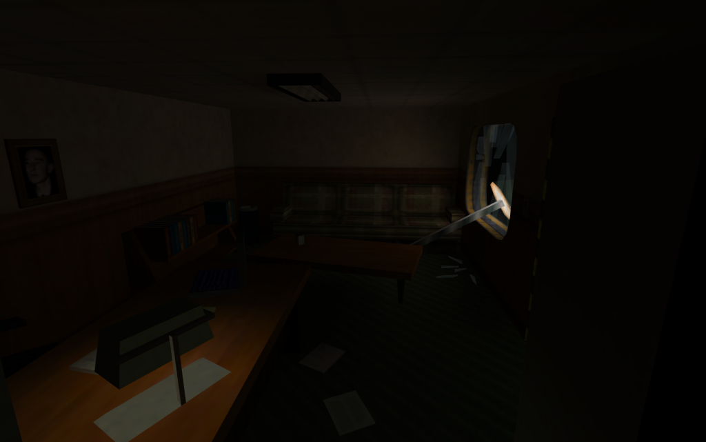
This here is my first attempt at a map. It started out as a single room which I wanted to decorate so I can get some practice with the JACK Hammer Editor but I kept adding to it and soon I gave into what was once a dream of mine, to create my own single-player campaign.
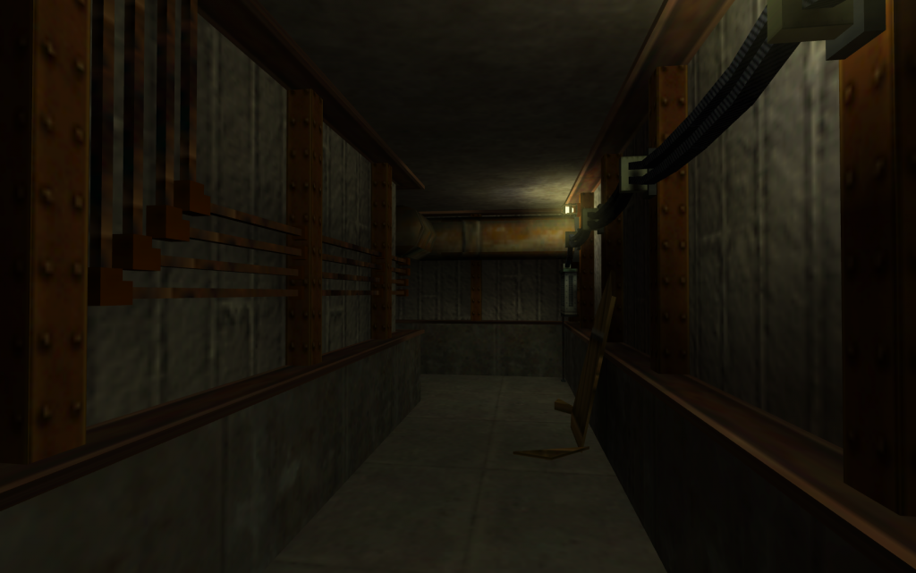
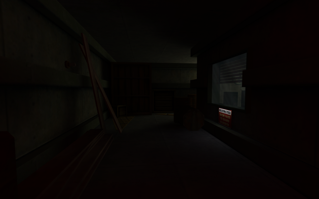
Now as much as I would like to brag about my mapping skills there is not much to brag about, due to lack of experience and the proper know-how I will make use of default Half-Life textures only and I have had to resort to original prefabs (although they have a certain charm, are far from perfect). Hopefully I will be able to pull through and complete this map/campaign, I would have this turn into another one of the countless mods/maps that get announced and never released. So far progress has been slow but steady, I started using the Hammer Editor this past Monday (the 26th) and I am happy with how much I have been able to do so far.
Do feel free to share your opinions and/or advice though, I very much need it.
(P.S: Please ignore the file name, it too is WIP)
9 Comments
You must log in to post a comment. You can login or register a new account.


Welcome to TWHL and keep up the mapping work. ^^
- Always name your maps so that it's clear what map it is and so that it won't possibly conflict with other maps in the player's
- Never surround your whole map with a box, even during construction. Sometimes you, of course, may be working on a map that's a bunch of floating islands or a small floating station, but in most cases you should have only the geometry that you really need. Boxes around maps increase compile time and cause overdraw. Oh yeah, they also make HLVIS cry.
- You have very rich detail, but seem to have focused almost only on that. You should complete your map in the first place, detail comes later, so spend your energy on actually making the map and not sugaring it over and over. Also, maps with low detail often are better than many overdetailed ones. It doesn't mean that you always have to keep your maps' geo simple: add as much detail as your skill allows and as long as it doesn't take you away from finishing the map itself. As you get better, you'll be able to produce maps with even larger amounts of detail.
- Try to restrict yourself from overusing
- Try to establish consitensy. The first vent cap that the player has to break is broken by hitting the Use key. However, as you're crawling the vent you see another such vent cap on the left (if I recall correctly), but you can do nothing with it. And the third one breaks when you step on it, but not from hitting the Use key either. So it's not entirely clear how to actually break vent caps in your map, and which of them break. Mark breakable vent caps with a different texture or generally make them look different, and decide whether your vent caps break from touching them, Using them or smashing them with the crowbar or any other weapon. Same applies to doors (not in your map though, just in general). Sometimes some maps have a few doors that open by Using them and the rest are opened somehow else. Unless you have a very strong reason to break the rule, don't do that.
If I'm wrong at any of these points, correct me. It's 0:38 here and my brain is half-RIP.mapsfolder;game_textto tell the player what to do - show what to do instead. It's much easier to direct the player's attention towards something if there's no unnecessary detail clutter around. For example let's take that one blue monitor in one of the rooms: the whole room is dark, and the only thing that stands out in all this darkness is the blue computer screen. Of course the player will think that it's something important and, most likely, usable.And happy mapping!
Regarding game_text I agree and have already considered it's reduction or entire removal.
And as for consistency, I do acknowledge the issue however I am afraid that I am not entirely sure how to resolve it. My only hope would be to check-out other maps/mods and learn from them.
I do thank you for the feedback though, it is a well needed wake-up call I will try to make some improvements based on it for the next file upload.
Vent with black background, texture XYZ -> unbreakable, inaccessible.
Also, Deus Ex for example has all metal crates unbreakable, but slightly pushable, while all its wooden crates are pushable and breakable.
For consistency, I will try, hopefully I wont let anyone down.