Bridge The Gap 2.0
 HL
HL
Bridge The Gap 2.0
by
monster_urby
Posted 4 years ago2020-10-29 12:13:16 UTC •
Completed •
Half-Life
- Name
- Bridge The Gap 2.0
- By
-
 monster_urby
 - Type
- Map
- Engine
- Goldsource
- Game
- Half-Life
- Category
- Completed
- Included
- BSP, RMF/VMF
- Created
- 4 years ago2020-10-29 12:13:16 UTC
- Updated
- 4 years ago2020-10-29 14:46:42 UTC
- Views
- 5762
- Downloads
- 1049
- Comments
- 7
- Rating
- 5.00 (6)
- Reviews
- 4
BRIDGE THE GAP 2.0 - by UrbaNebula
A 2020 remake of the unofficial entry for the RUNTHINKSHOOTLIVE.COM Bridgeville challenge
Plot:
Those pesky HECU boys are at it again. Just look at what they've gone and done this time. Lowering the bridge leading to the surface elevator and then sealing off the control room. Even worse than that, this part of the facilty is crawling with Xenians and their ongoing dispute with the Black Mesa Science Team over how dead they should be doesn't appear to be easing off at all!
Author's Note:
This map has been designed and tested with the hardest difficulty in mind and as such, plays best on Skill 3. You can set this in the console before starting the map, by simply typing "skill 3"
Includes:
- Oddly enough, version 2.0 of Bridge the Gap includes less content than the original.
- You get a map.
- You also get this lovely readme.
- You do get the map source file.
- You get no The Core wad files.
Installation/How to Play/Author's Note:
- It puts the "btg2.bsp" file in the "valve/maps" directory.
- It launches "Half-Life" from the Steam library or by whatever means you normally use.
Credits:
- Everything that makes up the map was done by me, UrbaNebula.
- Everything else by Valve Software.
- MrFloyd tested it a couple of times and provided feedback. If you think the map sucks, blame him.
Note:
Please do not use/edit these files without contacting me first.
Thanks:
- TWHL.INFO for almost everything I know about mapping.
- J.A.C.K for just being an all round awesome tool.
- Everyone in the Scotch and Coffee group for being genuinely fantastic people.
- Everyone who is still working on tools and content for the GoldSRC, BUILD and classic idTech engines. You rock.
- Valve Software for making one of the greatest games of all time.
- You the player for downloading, enjoying and leaving a positive review on this map.
7 Comments
You must log in to post a comment. You can login or register a new account.


Texturing — 10
Ambience — 8
Lighting — 10
Gameplay — 8
Gameplay loses a couple of points just because after what was a really challenging and fun middle section with grunts, it gets steadily easier towards the end and then has no big finalé.
Great work. Get back to The Core.
Texturing — 10
Ambience — 8
Lighting — 9
Gameplay — 8
After the first fight, in the lift I had to use noclip after 4 retries to hit that damn ladder and almost dying :)).
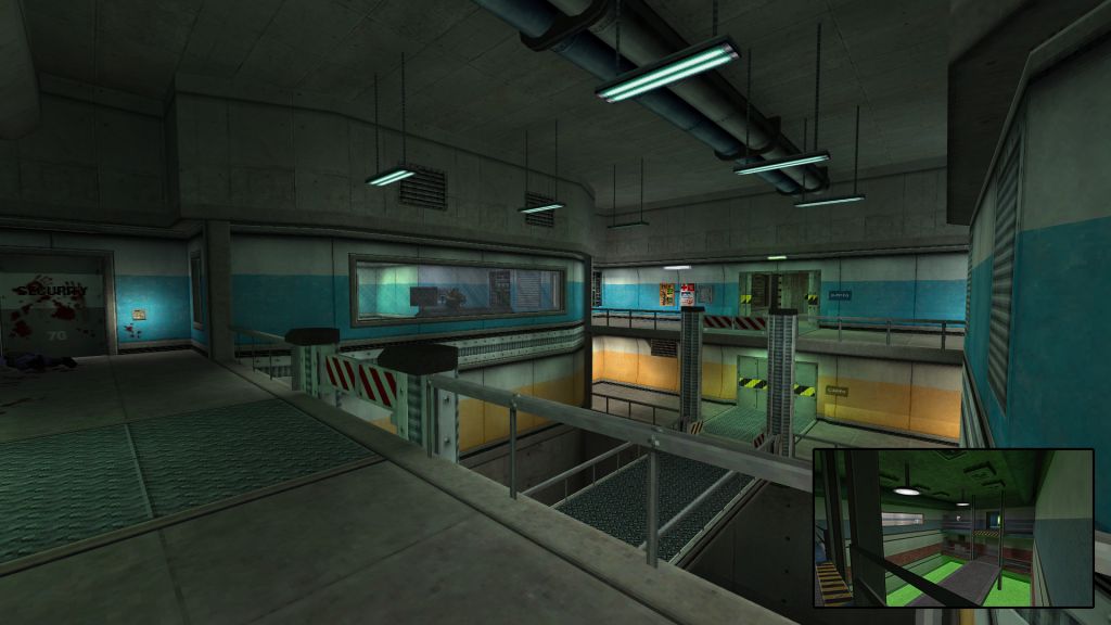
The architecture denotes a skill that has been mastered over the years of mapping. It's clean, coherent, pleasant to the eye. It feels like Black Mesa while still being something original.
The texturing went hand in hand with the architecture, and it left my eyes satisfied.
The ambience - not so much. There's a lack of dynamism (I know it's HL style gameplay we're talking, but we still have all kinds of opportunities as mappers). For example, I think the area under the bridge is a missed opportunity for something happening there - a black mesa metro line for example with a metro passing from time to time. Just my imagination :P.
Lighting - overall good, but as mentioned before, there are few spots with very dim areas and I'm not sure this is actually the map or my settings/monitor.
Gameplay - It's always hard for me to judge this one, because Half-Life is an old game and I don't want to be harsh to a mapper who spent time and effort on creating something nice. For the given context, I think the challenge was sufficiently good, but after finally "bridging the gap", the show was over - well, except for a pesky turret waiting at the end.
I totally understand everyone's procrastination - such as yours with The Core. Instead of doing my chores and preparing for the next week, my brain considers that this review is much more important of a task.
I especially like how the first grunt encounter was redesigned. You can now sneak up on a grunt, only the be caught by surprise by grenade-launching grunt on the other side. Gave an interesting dynamic to that fight. The area also looks more like a real functional place than v1.
Some of the other enemies felt a bit dumb though, just passively waiting around a corner until you show up. It would've been nice if the grunts in the control room had acknowledged your presence in the bridge room somehow - a 'Freeman!' shout, a gesture, one or two grunts running around. The fan obstacle setup was better in v1, because the obstacle was visible before the solution was. In v2, I first pushed the button, then found the vent, and wasn't entirely sure what that button had done.
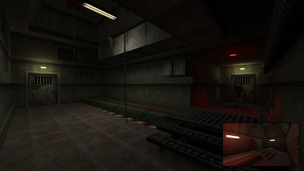
But other than those minor issues, it's an enjoyable map and it shows good attention to detail. I like how you create ladders - much better than the standard single-brush approach. Also, '86 was a good year indeed! Now I wonder whether there are any other easter eggs to be found...
Texturing — 10
Ambience — 8
Lighting — 9
Gameplay — 8
really
Texturing — 10
Ambience — 9
Lighting — 10
Gameplay — 9