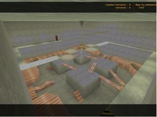
Ka_KnifeWorld
 CS
CS
Ka_KnifeWorld
by
CyberMaster
Posted 20 years ago2004-03-19 19:56:42 UTC •
Completed •
Counter-Strike
- Name
- Ka_KnifeWorld
- By
-
 CyberMaster
 - Type
- Map
- Engine
- Goldsource
- Game
- Counter-Strike
- Category
- Completed
- Included
- BSP
- Created
- 20 years ago2004-03-19 19:56:42 UTC
- Updated
- 16 years ago2009-01-12 13:10:06 UTC
- Views
- 2252
- Downloads
- 736
- Comments
- 10
I've updated the map making it much more difficult to get to the Gun Room. I've made it more difficult becuase I've noticed that many people were whoring the weapons like mad! Everything is fine now! ENJOY!!!
10 Comments
You must log in to post a comment. You can login or register a new account.


When I first saw this map(the screenie on the vault), I thought "NEWB" cause of the texturing.
When I tested it, I saw that the brushwork was quite good(better than most trash we get) and that 'playability' was not-that-bad aswell. Remember I did not test this with another player, Ill try it with jaardsi laterz.
The main problems are 1,Texturing and 2,Lighting.
Try giving more life to the walls, not just the same old repeating textures... Maybe remove the walls completely and put a fence with SKY behind and over them? Also, the wooden planks are alittle over-used aswell as that Crete texture...
You need to work with the aligning(try the 'Fit' button
The lighting is pretty much consistant of about 10-20 point-lights, which gives a pretty crappy result.
Avoid using light entities as much as possible, use the small and hand texlights! Tutorial: http://www.vlatitude.com/tutorials.php?tutID=5.
And dude, remove the armoury
Overall score?... Dunno
OMG not another cs map! We should make a seprate cs vault for this! (Dont take it personally im just pokin fun)
Any more comments to help me out in the future?