Tutorial: Skewing textures in Hammer Last edited 11 years ago2013-10-08 19:58:00 UTC
You are viewing an older revision of this wiki page. The current revision may be more detailed and up-to-date.
Click here to see the current revision of this page.
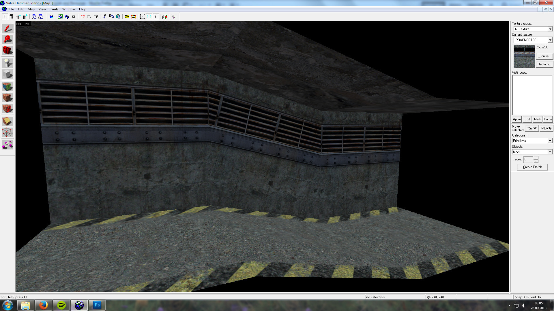
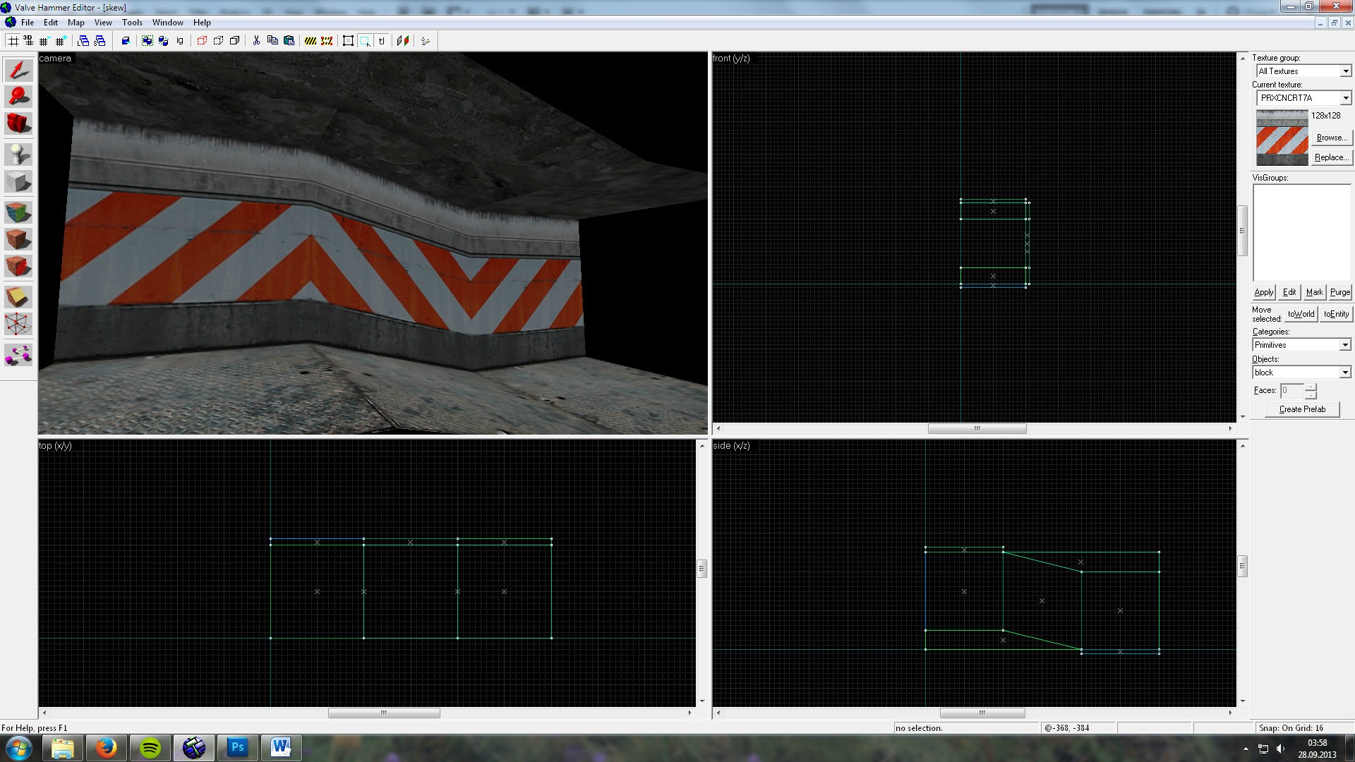
If you’ve ever been in a situation like for example having to skew a wall in a particular direction so that it follows an elevation in the floor, you’d probably have to rotate the wall texture and end up with something like this:This can be okay for some occasions, but doesn't really look that good. What do you do if you want the wall texture to run parallel (either vertically or horizontally) with the wall textures next to the skewed brush? You might think it's impossible, which it practically has been, but I’ve discovered a rather simple trick to achieve this using a couple of tools found in Hammer that I suspect are mostly overlooked: Align To View and the Camera tool.
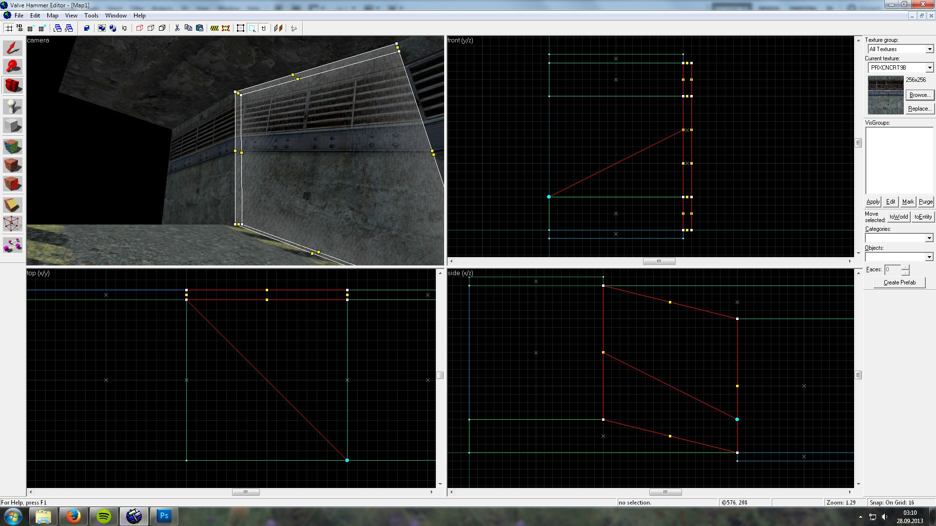
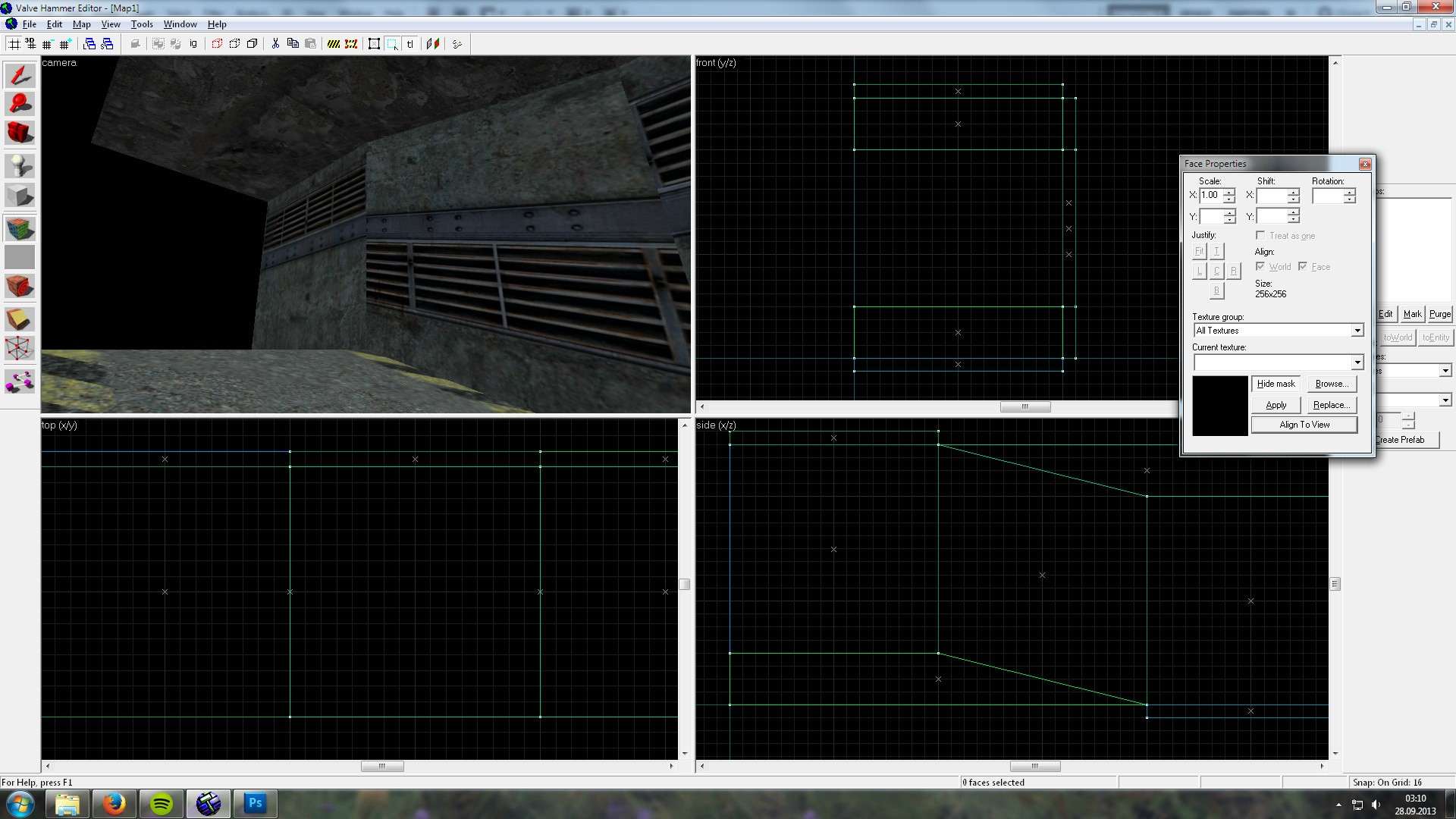
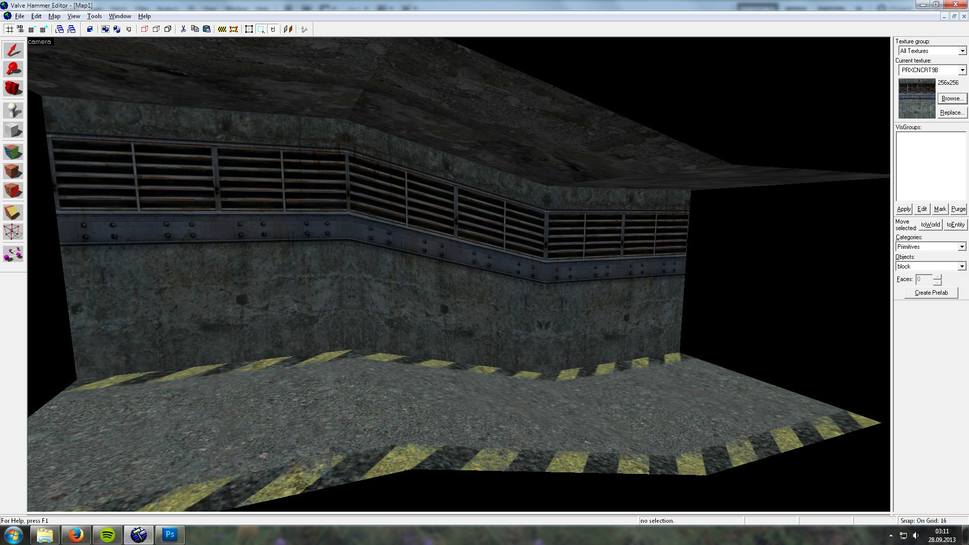
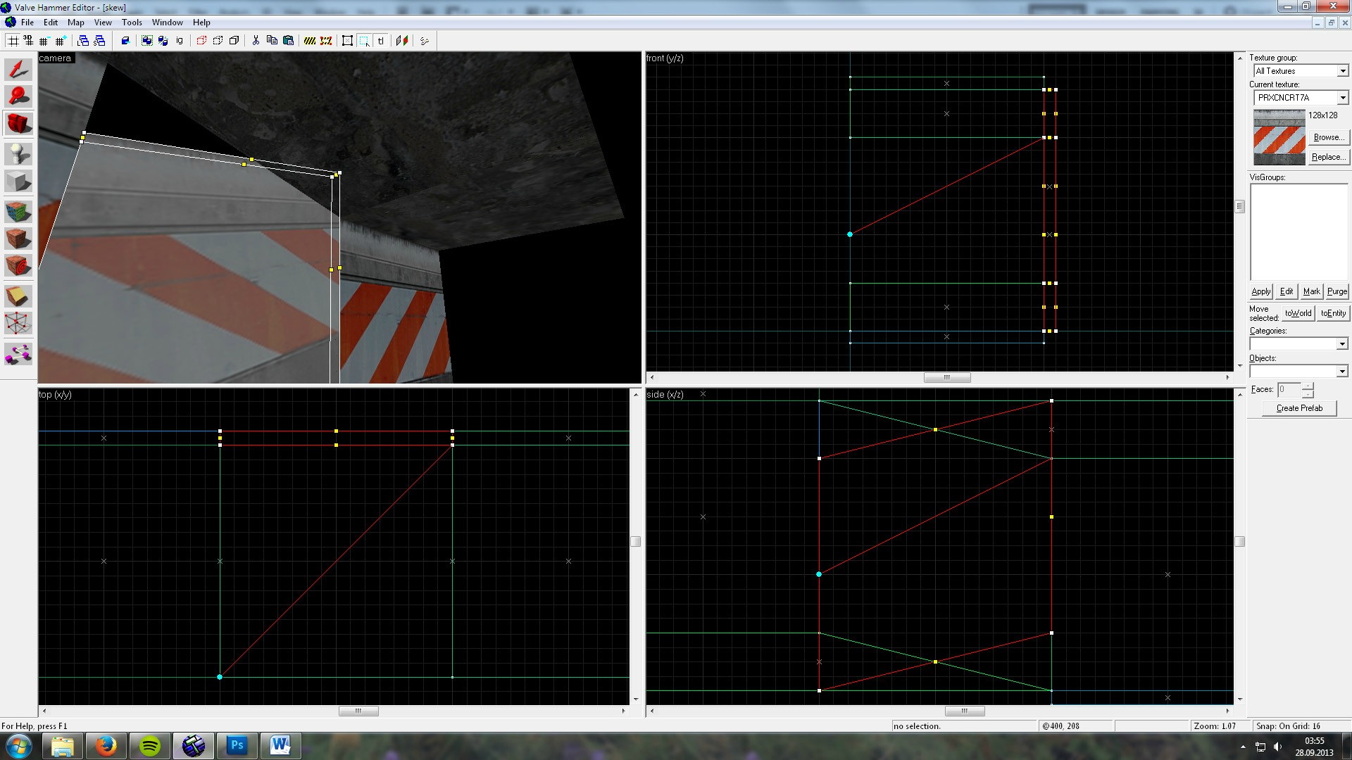
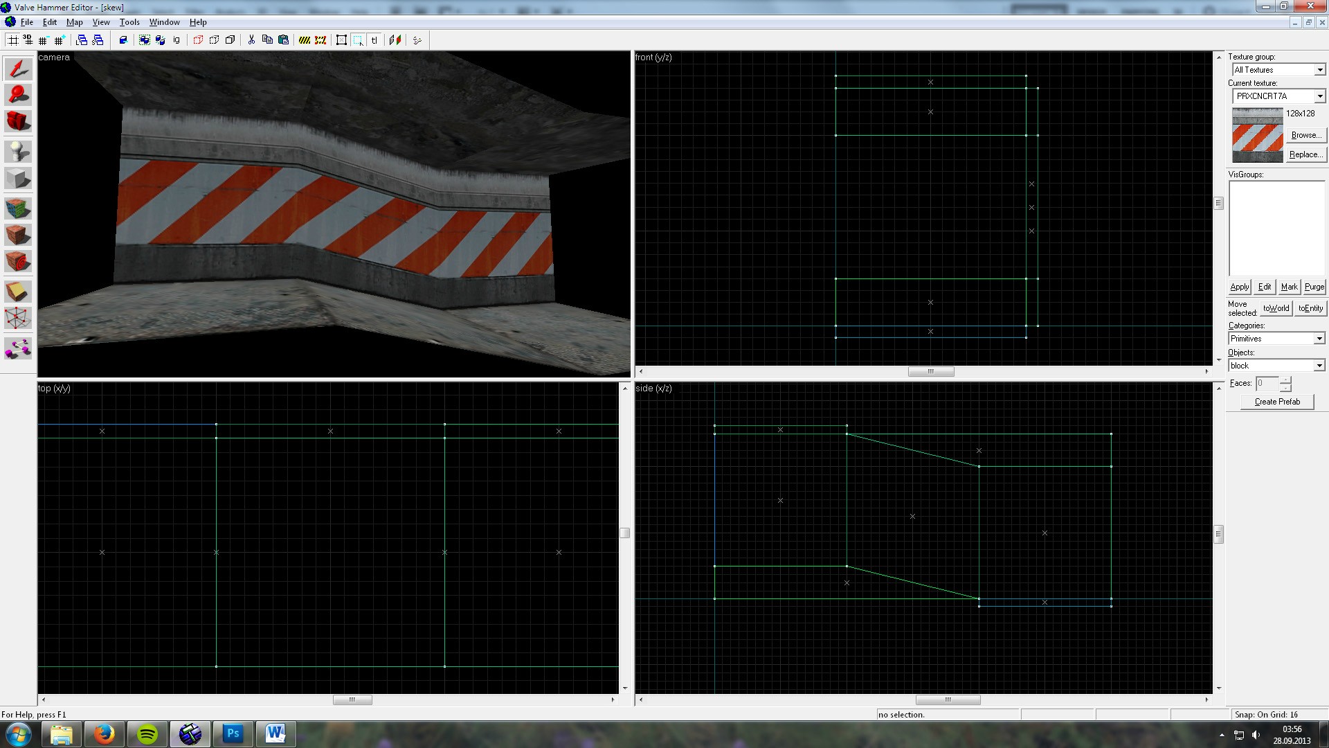
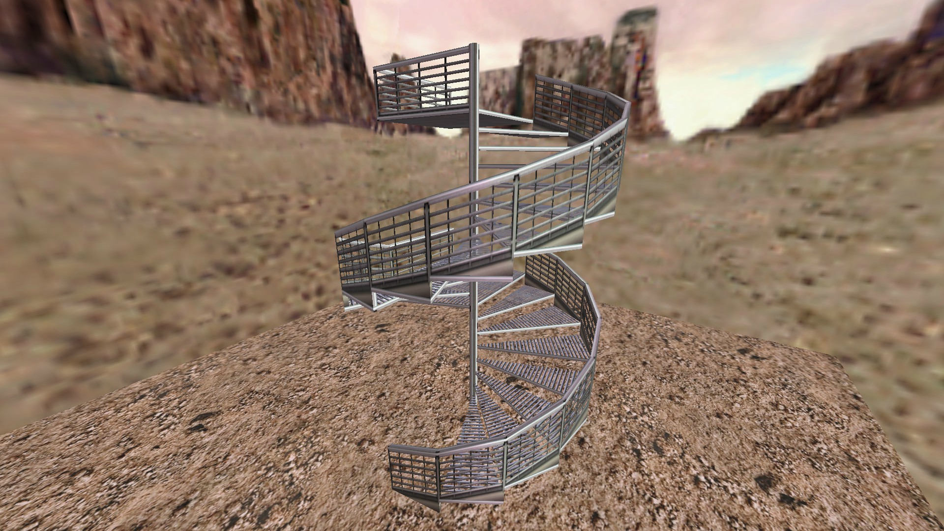
What you need to do is select the Camera tool (Shift+C) and in the 2D Top viewport (in this particular example, if the brush is oriented differently, e.g. with the face you want to manipulate facing upwards, you might have to use another viewport) and place the camera itself along one edge of the brush and as many units away as the brush is long (which in this case is 256 units) and have the camera point 45 degrees towards the opposite edge (check the Top view in the screenshot if you don’t understand what I mean). It is a good idea to downsize the grid to 1 and zoom in and check that the camera is aligned correctly, as it snaps to grid 1. Then, in the 2D Side viewport (again, in this particular example), you will have to place the part of the camera tool that “points” (the red line) at the middle point of one edge of the brush, and the camera itself between the middle point and the lower point of the opposite edge (i.e. a quarter of the total length). The easiest way to find these points is to enter vertex manipulation (Shift+V) with the brush selected, then while in vertex manipulation you select the Camera tool again. Confirm that the camera is placed exactly correct by downsizing the grid to size 1 and zooming in.The next step is to go into the 3D viewport (careful not to move the camera around), enter Texture Manipulation (Shift+A), select “Align To View” from the lowermost drop-down list, and then click on the face you wish to skew. You should get something like this, with the texture being upside down:This is easily fixed by flipping the texture 180 degrees and hitting “Fit”.You can also (if you look very carefully) notice that the skewed texture is actually flipped the wrong way horizontally - this can be a problem in certain cases, like if you use a texture similar to the one I’ve used in the following screenshot:This can actually look quite cool, but if the effect is undesirable and you want to avoid having to flip all the adjacent walls horizontally so that they match the texture of the skewed wall, you will have to, before going through the technique I’ve now described, flip the skewed wall horizontally, then just do everything from the opposite direction:Then you should end up with a correct perspective (obviously you need to flip it back once you're done).And that’s it! Now, don’t ask me why you have to have the camera tool pointing in a steeper angle than the brush is skewed to get a correct angle on the texture, as common sense might suggest that the camera should point at the same exact angle, but this technique does require a bit of trial and error; it’s not always obvious where or at what angle you will have to place the camera and the red line “pointer” (if you have a steeper angle on the skewed brush, for instance, you will also have to have a much steeper angle on the camera than in the example in this tutorial), but with persistence you can achieve greatness the likes of which has been previously unknown to mankind (or something along those lines), like the handrails on this spiral staircase I created:Thanks for reading, hopefully someone will find this useful.
What you need to do is select the Camera tool (Shift+C) and in the 2D Top viewport (in this particular example, if the brush is oriented differently, e.g. with the face you want to manipulate facing upwards, you might have to use another viewport) and place the camera itself along one edge of the brush and as many units away as the brush is long (which in this case is 256 units) and have the camera point 45 degrees towards the opposite edge (check the Top view in the screenshot if you don’t understand what I mean). It is a good idea to downsize the grid to 1 and zoom in and check that the camera is aligned correctly, as it snaps to grid 1. Then, in the 2D Side viewport (again, in this particular example), you will have to place the part of the camera tool that “points” (the red line) at the middle point of one edge of the brush, and the camera itself between the middle point and the lower point of the opposite edge (i.e. a quarter of the total length). The easiest way to find these points is to enter vertex manipulation (Shift+V) with the brush selected, then while in vertex manipulation you select the Camera tool again. Confirm that the camera is placed exactly correct by downsizing the grid to size 1 and zooming in.The next step is to go into the 3D viewport (careful not to move the camera around), enter Texture Manipulation (Shift+A), select “Align To View” from the lowermost drop-down list, and then click on the face you wish to skew. You should get something like this, with the texture being upside down:This is easily fixed by flipping the texture 180 degrees and hitting “Fit”.You can also (if you look very carefully) notice that the skewed texture is actually flipped the wrong way horizontally - this can be a problem in certain cases, like if you use a texture similar to the one I’ve used in the following screenshot:This can actually look quite cool, but if the effect is undesirable and you want to avoid having to flip all the adjacent walls horizontally so that they match the texture of the skewed wall, you will have to, before going through the technique I’ve now described, flip the skewed wall horizontally, then just do everything from the opposite direction:Then you should end up with a correct perspective (obviously you need to flip it back once you're done).And that’s it! Now, don’t ask me why you have to have the camera tool pointing in a steeper angle than the brush is skewed to get a correct angle on the texture, as common sense might suggest that the camera should point at the same exact angle, but this technique does require a bit of trial and error; it’s not always obvious where or at what angle you will have to place the camera and the red line “pointer” (if you have a steeper angle on the skewed brush, for instance, you will also have to have a much steeper angle on the camera than in the example in this tutorial), but with persistence you can achieve greatness the likes of which has been previously unknown to mankind (or something along those lines), like the handrails on this spiral staircase I created:Thanks for reading, hopefully someone will find this useful.
21 Comments
You must log in to post a comment. You can login or register a new account.

Thanks for the tutorial!
Also, I prefer to ALWAYS align textures to face, because when players draw decals on walls, they otherwise will be distorted.
bravo
Awesome looking spiral staircase, too.
** only because I don't quite understand the instructions for camera placement.
Thanks for the tutorial, it'll be of much help.
http://nightfire.no-ip.org/img/hammeraligntoviewproblem.png
edit: to answer my own question: unfortunately it's not possible due to how the texture coordinate system works. it only has 2 axes and a vanishing point needs at least 3. It might be possible to coax it with a lot of subdivision and triangulation.