
Very nice. Maybe a bit more space vertically before the headings you just changed the typeface of, though? They sorta run into each other rather.
favicons are pro.
Gamingparents.org
Created 18 years ago2006-08-22 01:28:49 UTC by
 satchmo
Created 18 years ago2006-08-22 01:28:49 UTC by
satchmo
Posted 18 years ago2006-09-09 16:55:50 UTC
Post #196099


Posted 18 years ago2006-09-09 17:18:07 UTC
Post #196103
I think that orange bar where it says "a playground for grownups" looks a little odd. It's a little too seperated from the main title, so you don't immediately see it as being associated with it. It looks more like it's part of the menu.
Also, although I'm pretty sure you've decided on this already, I don't think the background for the title is all that great. It doesn't convey that it's a site for gamers in any way, unless you recognize that little part from Half-Life 2, something not many people (other than obsessive HL freaks like us) would get.
Also, although I'm pretty sure you've decided on this already, I don't think the background for the title is all that great. It doesn't convey that it's a site for gamers in any way, unless you recognize that little part from Half-Life 2, something not many people (other than obsessive HL freaks like us) would get.


Posted 18 years ago2006-09-09 19:11:50 UTC
Post #196108
It looks more like it's part of the menu.I've re-adjusted its position. Is it better?
I am a die-hard Half-Life fan. The background stays, even if most members don't get it.
Once again, has anyone tried hacking into the site? I want to know if there is any security holes. Thanks.


Posted 18 years ago2006-09-09 19:59:33 UTC
Post #196109
um, I guess I could try when I have my security center box hooked up again, its been disabled for a while, but ill put it back up for you

Posted 18 years ago2006-09-09 21:20:27 UTC
Post #196113
Site's lookin' great. One problem though - I dont know if it's my web browser or some display issue but the 'search...' bar is overlapping some of the text. This occures in just about every page... at least the ones I've seen: forums, home, and registration.
Looking awesome, I can't wait untill the site really becomes active!
Looking awesome, I can't wait untill the site really becomes active!

Posted 18 years ago2006-09-09 21:44:49 UTC
Post #196117
its been disabled for a while, but ill put it back up for youMuch appreciated!
the 'search...' bar is overlapping some of the text.I believe it's a browser issue. Thanks for pointing it out for me. I want as many people to view my site as possible to smooth out all the kinks with different browser settings.
I'll try to work on that issue.
Posted 18 years ago2006-09-09 21:45:04 UTC
Post #196118
I see it to, and im useing opera
Posted 18 years ago2006-09-09 21:51:03 UTC
Post #196119
likewise
EDIT: Oh, I just realized: are you going to impliment a PM system for the forum?
EDIT: Oh, I just realized: are you going to impliment a PM system for the forum?
Posted 18 years ago2006-09-09 22:14:50 UTC
Post #196122
Oh, I just realized: are you going to impliment a PM system for the forum?Yes, that's on the list of todo's.
I changed the location of the search box, but now it has an ugly bar going across the page for IE. It looks fine on FF.
I guess I'll have to work on that.
Posted 18 years ago2006-09-09 22:24:32 UTC
Post #196124
make it powered by mercutio  7th made it so it has to work well
7th made it so it has to work well
Posted 18 years ago2006-09-09 22:56:14 UTC
Post #196129
Move the search box, it looks odd where it is now.

Posted 18 years ago2006-09-09 23:21:30 UTC
Post #196141
I fixed the problem.
Move the search box, it looks odd where it is now.Do you mean the current position? I kinda like it there. It's on top of the header graphics, and it distinguishes itself from the search box for the forum (which functions independently from a site search, unfortunately).

Posted 18 years ago2006-09-09 23:45:36 UTC
Post #196144
Hmm...I have to agree with Ant, it does look kinda strange stuck on top of the header like that.

Posted 18 years ago2006-09-10 04:37:14 UTC
Post #196168
Can't register names with a dash in. A bit of an unnecessary restriction there?
Posted 18 years ago2006-09-10 09:09:50 UTC
Post #196174
Hmm...I have to agree with Ant, it does look kinda strange stuck on top of the header like that.Your feedback is important to me, so I changed the position. How about now?
Can't register names with a dash in. A bit of an unnecessary restriction there?Sorry Seventh. I never intended to discriminate against anyone, but the dash-less restriction was not placed by me. It has something to do with the server or Joomla. Would you be able to spell your name "SeventhMonkey"?

Posted 18 years ago2006-09-10 09:15:29 UTC
Post #196175
Are you sure joomla is the best CMS to use? There're loads clean, pretty ones out there...

Posted 18 years ago2006-09-10 10:11:48 UTC
Post #196176
Joomla! enjoys a large Open-Source community and I like the interface quite a bit. I can get help whenever I need it (just like mapping for HL/HL2).
I know there are other ones (like Drupal), but I am pretty much committed to Joomla! at this point. The number of extensions for Joomla is also quite impressive.
I know there are other ones (like Drupal), but I am pretty much committed to Joomla! at this point. The number of extensions for Joomla is also quite impressive.
Posted 18 years ago2006-09-10 18:52:40 UTC
Post #196253
Yeah, I'd say it's a bit late to choose.
Shame about the nick restrictions, but I'll just reg. as Sasha when I get around to it.
Shame about the nick restrictions, but I'll just reg. as Sasha when I get around to it.
Posted 18 years ago2006-09-10 19:07:40 UTC
Post #196254
I've re-adjusted its position. Is it better?Bit of a late response, but yes, it looks much better now.

Posted 18 years ago2006-09-10 19:45:46 UTC
Post #196257
This is a random suggestion:
You should make the site auto-resize Avatars like TWHL does. TWHL is one of the few sites that does this, and I love it Its a big convience, and makes a site a winner in my book (maybe not, but its cool XD)
You should make the site auto-resize Avatars like TWHL does. TWHL is one of the few sites that does this, and I love it
Its a big convience, and makes a site a winner in my book (maybe not, but its cool XD)
Posted 18 years ago2006-09-10 19:52:10 UTC
Post #196258
I'll look into the avatar resizing option, but getting a PM system working is highest on my priority.
[EDIT]: While I am working on the PM integration into the site, I have added a member list page. Check it out!
[EDIT]: While I am working on the PM integration into the site, I have added a member list page. Check it out!
Posted 18 years ago2006-09-11 04:41:04 UTC
Post #196267
I'm sorry, but I have to complain about the logo yet again. It's horribly low-res and fairly boring. I can understand the extra size, but 2048px is almost too wide - even though there might be people who do browse at such resolutions, I'd say they're extremely rare.
Settle with a 1600x1200 screenshot.
Settle with a 1600x1200 screenshot.
Posted 18 years ago2006-09-11 10:54:26 UTC
Post #196285
I do appreciate the feedback, but I am going to let the banner be for now--unless more people complain about its ugliness.
And who knows, five years from now, everyone might be browsing using a 24" monitor. 2048px width might not be so rare in the near future.
P.S. By the way, I sent you (Zombieloff) a PM at GP. Would you let me know whether you received it? It's a brand new system, so I don't know whether everything works or not. Thanks.
Posted 18 years ago2006-09-11 13:06:18 UTC
Post #196288
You have no messages in your inbox.You have no messages in your inbox.Apparently not.
I'll try sending you one.
Posted 18 years ago2006-09-11 16:12:03 UTC
Post #196311
You should move the "Greetings, username" text and the Logout button above the main menu, on the orange bar under the header.
Kinda like this: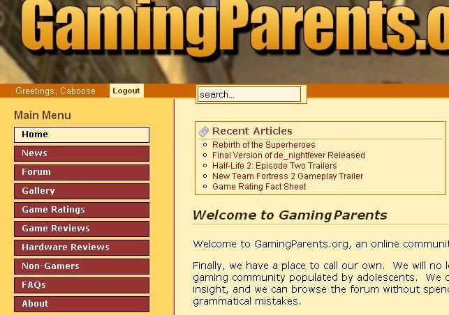
Kinda like this:
Posted 18 years ago2006-09-11 18:06:34 UTC
Post #196321
Apparently not.Zombieloff, sorry about the confusion. I registered a test user and tested out the PM system with "it". After I made sure everything works properly, I deleted the original PM I sent you. That's why you don't see the message in your inbox.
I'll try sending you one.
Thanks for the suggestion, but I am sticking with the current layout and positioning of the logout button.
TWHL has a very nice and friendly design, but I am not trying to clone this site.

Posted 18 years ago2006-09-14 11:54:21 UTC
Post #196498
I have added many new features to GamingParents and also altered (hopefully for the better) the layout of the content.
I would love to hear your opinion on the changes!
I would love to hear your opinion on the changes!

Posted 18 years ago2006-09-14 12:23:25 UTC
Post #196499
hmm, whoever wrote that Gangland review must be a master of the English language 

Posted 18 years ago2006-09-14 13:57:02 UTC
Post #196502
Indeed.
Not only masterful, but colorful as well.
Not only masterful, but colorful as well.
Posted 18 years ago2006-09-14 16:06:08 UTC
Post #196517
Hmm... would it be possible to view the thread as you post? It helps (at least for me) alot in getting facts straight n such.
Posted 18 years ago2006-09-14 16:06:37 UTC
Post #196518
I still want to know how to submit articles
Posted 18 years ago2006-09-14 16:17:27 UTC
Post #196520
Oops, my mistake: I didnt realize that the posts were below the reply box, not above, like here on TWHL. Sorry, this is the first forum I've belonged to .
.
Posted 18 years ago2006-09-14 16:57:26 UTC
Post #196522
I still want to know how to submit articlesThanks for volunteering.
I've just upgraded your account to allow article posting. Keep in mind that all posts submitted are moderated first before they are published, so they might not appear on the site immediately.
Posted 18 years ago2006-09-14 17:18:07 UTC
Post #196523
A OK
Posted 18 years ago2006-09-15 18:01:28 UTC
Post #196596
Just noticed a little issue with the Shout! box. The scroll bar covers some of the box's text. I think that it's covering up more than the space the actual bar takes up. If you look at the shot, the word "left" in my shout has the entire f and t, as well as half of the e covered. I just wanted to point that out if it makes a difference when you fix it.
I'm also using Opera.
EDIT: Just noticed that it occures every other time a page loads, including refresh.
I'm also using Opera.
EDIT: Just noticed that it occures every other time a page loads, including refresh.

Posted 18 years ago2006-09-16 10:16:18 UTC
Post #196638
Really, the best place to promote a website for older gamers. Now it's going to be full of teenage wankers with no job and tons of time to waste...
I like the idea.
I like the idea.

Posted 18 years ago2006-09-19 10:36:05 UTC
Post #196932
Hey, TWHL is my root in gaming community. I got initiated here. How can I possibly leave you guys out when I start this project?
I'm actively recruiting more members. I've gotten three of my pediatric colleagues to join, and I also got a professor in communication to join. He's an eminent scholar from Michigan University. All three adults are parents (and they all play lots of games, including the Half-Life series).
I'm actively recruiting more members. I've gotten three of my pediatric colleagues to join, and I also got a professor in communication to join. He's an eminent scholar from Michigan University. All three adults are parents (and they all play lots of games, including the Half-Life series).
Posted 18 years ago2006-09-20 19:07:48 UTC
Post #197072
I've made some modification to the layout of the site. I think it still looks okay.
Posted 18 years ago2006-09-20 19:22:12 UTC
Post #197079
"Okay"? Nah, it looks much better.

Posted 18 years ago2006-09-20 19:26:26 UTC
Post #197080
I just tuned into gamingparents.org to see what all the fuss is about. This is a really cool idea, so great job. I hope your community grows, though I won't be attending your forum. Its just not my type of people, you know... since I'm not a parent... yet.
It all looks great
... except for this:
It all looks great
... except for this:
5. AVOID the "first person shooter", killing-machine games.D:

Posted 18 years ago2006-09-20 20:16:59 UTC
Post #197084
... except for this...Is that a joke? I don't recall seeing that statement anywhere on my site.

Posted 18 years ago2006-09-20 20:31:02 UTC
Post #197085
Personally I think the link buttons are kinda lame but changing them would require a bunch o' revamping so down't worry about it

Posted 18 years ago2006-09-20 20:42:33 UTC
Post #197088
Right here, Satchmo.

It was a joke, but its also ironic considering your apparent forte of genres.

It was a joke, but its also ironic considering your apparent forte of genres.
Posted 18 years ago2006-09-20 23:31:19 UTC
Post #197095
Thanks, Worldcraft dude.
I didn't like that line, so I edited it out.
Any sentence that makes a blanket statement against my favorite gaming genre has gotta go.
I didn't like that line, so I edited it out.
Any sentence that makes a blanket statement against my favorite gaming genre has gotta go.

Posted 18 years ago2006-09-21 15:22:15 UTC
Post #197145
1. LIMIT game playing time.FIEND!

Posted 18 years ago2006-09-21 16:24:29 UTC
Post #197150
I'd really much prefer it if you reduced the numbers of sections of the forums, :(. The whole forum takes ages to browse.
Put every board (Gaming, General Discussion, Parenting) into their own section, leaving only 3 sections, while putting review submissions somewhere else on the site.
Might be a tad drastic, this, but I really do believe too many sections damages a forum's user-friendly-ness quite heavily. Just my opinion though.
Oh and by the way, someone tip-off Jack Thompson about this site, you'd get lots of media coverage .
Put every board (Gaming, General Discussion, Parenting) into their own section, leaving only 3 sections, while putting review submissions somewhere else on the site.
Might be a tad drastic, this, but I really do believe too many sections damages a forum's user-friendly-ness quite heavily. Just my opinion though.
Oh and by the way, someone tip-off Jack Thompson about this site, you'd get lots of media coverage
.
Posted 18 years ago2006-09-21 16:51:14 UTC
Post #197152
you need an ability to comment on game ratings. i just want to tell that letting a 12 year old (heck many people voted lower) play WoW is a very bad idea.
and for the record i know my business.
and for the record i know my business.

Posted 18 years ago2006-09-22 21:03:01 UTC
Post #197253
I know that excessive number of forum sections can really dilute out the discussion and make navigation difficult.
However, it's also easier for some people who only want to participate in certain topics. It narrows down the topics for them.
I do appreciate your input, but I'm going to stick with the current configuration for now (unless other people find it troubling too).
And I agree with the commenting ability of the rating section. I am considering to implement that soon.
Posted 18 years ago2006-09-30 00:11:36 UTC
Post #197995
I have created a whole line of merchandise for the GamingParents community.
No pressure to buy anything, but I'm sure you'd be amused.
No pressure to buy anything, but I'm sure you'd be amused.

Posted 18 years ago2006-09-30 00:14:20 UTC
Post #197996
Woo, bumper sticker.

You must be logged in to post a response.