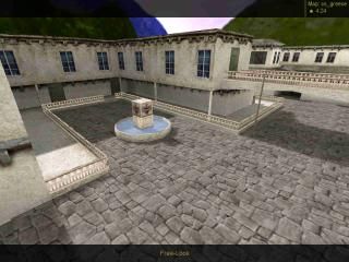
cs_greece
- Name
- cs_greece
- By
-
 suregork
 - Type
- Map
- Engine
- Goldsource
- Game
- Counter-Strike
- Category
- Completed
- Included
- BSP
- Created
- 21 years ago2003-08-17 04:41:00 UTC
- Updated
- 21 years ago2003-12-14 12:24:27 UTC
- Views
- 1822
- Downloads
- 1019
- Comments
- 4
- Reviews
- 0
A Hostage Rescue map set in a small greek town.
4 Comments
You must log in to post a comment. You can login or register a new account.

 CS
CS


The bad points : for the bad news the r_speeds are too high, for a counterstrike map this would not work to well online. It could work for The Spedcialists but still your r_speeds need to be reduced. r speeds of 1500 was the most i have seen in one part and around 1000 in a another part, they need to be reduced. Also i noticed you carved your archways and i can see the brush split up all across your wall, not good, i suggest you read the tutorial on vertex manipulation, that should fix that problem. The textures you have placed indoors, the one i think really looks out of place is the ceiling texture, the wood one, either the texture size is too big or you scaled it too high, thinner planks of wood would look more nice. Also there a a few other problem brushes i noticed, the round pergola thingy with the plants hangin down and water at the bottom, that plant brush needs to be shortend by a unit or two at the bottom of it to get rid of that texture line. Also the doors are a little too big, they dont look right, way out of scale compared to the rest of your map.
Overall i think your map has good potential, fix up the r speeds and the carved arches and you have a map that i would play on CS.