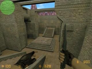
I reckon this map came out real cool. Please comment! I think this would be a kinda fun map but ive only played it on my own. please tell me how much i've improved from de_redplanet [also on this site]
Commented 20 years ago2004-04-26 09:45:03 UTCComment #1695
Not a great lay-out, some parts are also too similar.
But there's some nice details and architecture present too. You should do some more research on layour and gameplay and I'll see you making great maps. Keep it up!
Commented 20 years ago2004-04-27 03:39:39 UTCComment #1706
good for you worldcraft dude. i see dead people... about map. i liked atmosphere, there are some nice architecture details, but you could use all aztex textures at least. i mean these green wals and grass, because now it's too grey. you forgot "doom" sky from aztec too :). besides arch's are bad constructed. overall it's not bad map, soon you'll improve, just need more practic
Commented 20 years ago2004-04-27 04:13:11 UTCComment #1707
thanks for the comments. the architecture was inspired by the balins tomb movie. I think this map would be more enjoyable with quite a few people because when you are by yourself there is really no use for the healer (there is one in t base and the aim_map typeish part). i think this map is pretty good seems that this is my first attempt at good architecture and triggers and yes i know my layouts suck. i have never made a map with a good layout. I will try and improve this. Thanks for the constructive criticism. and yes worldcraft dude it is the knife on cs 1.6 - get used to it.
Commented 20 years ago2004-05-03 19:56:08 UTCComment #1782
Oh, it IS the default stem model! I played 1.6 over at this place called AtLANtis, a LAN party/gaming place and they have 1.6 It was pretty cool. Except I couldnt tell if I was hitting people or not beause they wouldnt bleed unless I got a headshot.
But there's some nice details and architecture present too. You should do some more research on layour and gameplay and I'll see you making great maps. Keep it up!