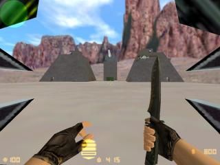
de_StarWars
- Name
- de_StarWars
- By
-
 Thor444
 - Type
- Map
- Engine
- Goldsource
- Game
- Counter-Strike
- Category
- Completed
- Included
- BSP, RMF/VMF
- Created
- 20 years ago2004-04-26 15:28:56 UTC
- Updated
- 20 years ago2004-04-26 23:07:32 UTC
- Views
- 3035
- Downloads
- 669
- Comments
- 9
- Rating
- 3.33 (3)
- Reviews
- 0
Hey, this map was concieved after i watched jobabob's starwars, that was some excellent work. Anyway, i loaded his wad into hammer to look at his textures, and looked at them, and at a much later date decided randomly to make an X-Wing model. This of course required a Tie Fighter oppossite it, though i ultimately went with a Tie Interceptor, and then i decided i needed a CS map to host them.
I think its a fairly complicated map as far as CS maps go, i have a locked door and env_globals where the bomb site is. I also made a point of using fancy holograms and display screens. If you want to
I think its a fairly complicated map as far as CS maps go, i have a locked door and env_globals where the bomb site is. I also made a point of using fancy holograms and display screens. If you want to
9 Comments
You must log in to post a comment. You can login or register a new account.

 CS
CS


Also there is absolutely NO USE for env_globals in cs maps.(i think, loz)
-Nice idea(old, though).
-Tie Fighters and the X-Wing were cool. I especially liked the see tru tex in the control pit.
-The map holograms in the rebel base.
-Teh lightsaber
Baddies:
-The cannons were too hard to control.
-It would have been lot cooler if the fighters wouldn't have behaved like some god damn cars. Check out air_fight2 for an example.
-Too low draw distance.
-Bad texturing in some areas.
-Ugly.
-High wpolies.
Overall score: 3
- Texturing
- Size (too friggin big, with that open area)
- Architecture
- r_speeds
Pros
+ Xwings/tie fighters
+ Cannons
+ Extras(switches, levers, buttons etc.)
Overall: 2.
This map is very inspinring to me for many reasons. Of course, because it is Star wars, is the main reason
I wish you would do this over! There are so many improvements you could make. If you still map or want to revisit this project, I have so many ideas for it!
Excellent idea and concepts, below average implementation.
I'm going 5 anyway, since i so enjoyed walking, and flying around this map!
5 Stars