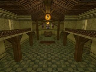
de_forsaken
- Name
- de_forsaken
- By
-
 Hypnos
 - Type
- Map
- Engine
- Goldsource
- Game
- Counter-Strike
- Category
- Completed
- Included
- BSP
- Created
- 20 years ago2004-05-23 07:17:39 UTC
- Updated
- 20 years ago2004-05-23 07:17:39 UTC
- Views
- 1703
- Downloads
- 605
- Comments
- 3
- Reviews
- 0
hello this is my third map.I hope you'll enjoy it. The ambiance is cool and the gameplay is good.@++ Hypnos
3 Comments
You must log in to post a comment. You can login or register a new account.

 CS
CS


Pros:
1. Good texture usage, they really fit the theme. Especially those windows.
2. Strong sense of place, it's very obvious a castle.
3. Strong atmosphere. I like it how much attention you give those sounds, very good.
Cons:
1. Somewhat bad lighting. At some places just average, at some places really bad. Like the green light on the trim of the castle wall, where you come out of the water. The yellow light inside doesn't really seem to fit well with the textures too.
2. Kindof strange layout. Somewhat complex, some area's look very similar and some are really different. I liked the chapel and the bridge, but the rest is just... plain castle wall or corridor. It just doesn't fit together.
After all, you do show potential put it doesn't come out so strong in this map. The combination of good and bad points just made me feel strange about it. Not a map I would quickly like.