cs_aztec2
- Name
- cs_aztec2
- By
-
 People Dust
 - Type
- Map
- Engine
- Goldsource
- Game
- Counter-Strike
- Category
- Completed
- Included
- BSP
- Created
- 20 years ago2004-06-05 23:25:33 UTC
- Updated
- 13 years ago2011-04-12 21:02:30 UTC
- Views
- 1935
- Downloads
- 594
- Comments
- 9
- Rating
- 3.50 (2)
- Reviews
- 0
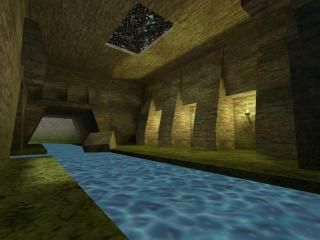
My first real map. The map is based off of the original de_aztec, used all the same textures. 6 UN peacekeepers from Panama were taken hostage by the same group that attempted to destroy the aztec ruins. This time they've run off to Guatemala and demand a ransom from the Panamanian government.
There is a long winding river going through most of the map. (Water is not clear, had problems with my Hammer deciding the water should be solid in Hammer but be compiled as a water entity[confused? so was I]). Recommended playing time set to at least 6 minute round time.
There are secret passages into the temples.
Hope you enjoy it.
9 Comments
You must log in to post a comment. You can login or register a new account.

 CS
CS


The rumbling on the background was nice but since I saw no lighting it made it look a bit faked. The real aztec did better...
Overall, the map looks too basic, it lacks finesse. But, it's your first map after all. Not a too bad attempt concidering that.
I just thought that might be worth an extra comment...
I was having some trouble with my water though Captain P, so I could not get it to actually become a real water entity to make it clear and match the waterfall. Whenever I tried to tie it to become an entity it would literally flood my entire map.
That noise you heard was supposed to be cicadas chirping but I never got around to taking them out.
The Simple Architecture was just my inexperience at mapping, and definitely could be fixed I know that. Once I actually become more experience in creating life-like architecture the maps should look more real.
But also the simple architecture goes well with the theme, as the name suggests, the people who created it were Aztec. They created real simple, blocky structures, so that could play into it.
Thanks for your comments guys
Water is best avoided as it gives a lot of faces that are visible very often, giving you high r_speeds. I use func_conveyors to create a nice water effect, gives much lower r_speeds and can be made very nice looking with the right textures.
The noise is no problem exept that it's too loud, wich makes it somewhat annoying. Subtle sounds often create a much better effect than loud things.
The waterfalls color differs from the water. Mhh, I know, there are no blue waterfall textures... Well, anyways, it doesn't fit so you'd better find a way around (custom textures?)
You'll get better with the architecture over time, it's just a thing you'll have to mind now and then. Gameplay is indeed more important, as that's what a map is intended for (well, in most cases... ;)), but great visuals are a nice extra.
Keep up the good work!
+Nice subtle ambients
+Excellent layout
+Excellent texturing
+Nice lighting, but maybe a little bright in the main areas
Architecture is really nice throughtout, except I'm noticing splitting that seems to biscect all your main walls... I'm pretty sure it's a brushwork thing and not a texturing problem, so whatever you do with this, I'd try to fix it as it's quite a distraciton imo.
I would put all the hosties in one area, but without playing the map in MP, I don't really know if this is necessary or not.
A very, very nice map.
If this was an original map and not a clone, I'd most likey go 5 stars, hence:
4 stars