Commented 20 years ago2004-06-19 11:09:28 UTCComment #2405
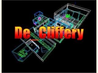
I had to give it a 2/5 because the texturing over all isn't that good, a very small map especially for a de_map, and the architecture... you can see lines where you have clipped stuff and haven't alligned it correctly. I do however like your spinning thing... but if you jump into it it will spin you are for a little while... and i do like your laser work, even though the circle around it you can see linees in... keep mapping...
Commented 20 years ago2004-06-20 11:09:27 UTCComment #2420
It seems you haven't run vis... also, there was some face-splitting in the map. And it looks like you used lights outside instead of a light_environment. So far for the technical parts...
The lighting looks reasonable, texture usage and alignment isn't very well done, and the map is quite small and allows very little variety in paths to go. I'd say, take a look at some popular CS maps and you'll be able to improve a lot. Keep it up!
Commented 20 years ago2004-06-23 15:47:08 UTCComment #2461
Ran it. Interesting collection of HL tricks. Should be used as a sample of what can be done. Other uses would be FY MAP. Don't much like the leaking wall of water. Good collection of interesting stuff for FY map. Too small for DE in my opinion. 2.5 out of 5. good C+ or B-
The lighting looks reasonable, texture usage and alignment isn't very well done, and the map is quite small and allows very little variety in paths to go. I'd say, take a look at some popular CS maps and you'll be able to improve a lot. Keep it up!