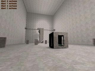
The Tower
 HLDM
HLDM
The Tower
by
wilsonscastaway
Posted 20 years ago2004-06-28 17:33:31 UTC •
Completed •
Half-Life: Deathmatch
- Name
- The Tower
- By
-
 wilsonscastaway
 - Type
- Map
- Engine
- Goldsource
- Game
- Half-Life: Deathmatch
- Category
- Completed
- Included
- BSP
- Created
- 20 years ago2004-06-28 17:33:31 UTC
- Updated
- 20 years ago2004-06-29 21:08:05 UTC
- Views
- 1580
- Downloads
- 589
- Comments
- 6
- Rating
- 1.00 (1)
- Reviews
- 0
Hey, it's me again.
This is a very good map for eight players.
Have fun!
I didn't make good textures, but they fit for this map.
This is a very good map for eight players.
Have fun!
I didn't make good textures, but they fit for this map.
6 Comments
You must log in to post a comment. You can login or register a new account.


Why? Well for starters, it's just a box. a big ugly box with some obstacles.
The textures are the same on every brush in the map - which looks horrible.
The map doesn't seem to be lit(it's fullbright), or it's just lit very badly.
The map offers very little room for any kind of gameplay to occur.
This looks like a first-map to me, or worse.
-Cons
- Texturing
- lighting
- layout
- desgin
- brushwork
0-star, but unfortunately 1 is minimum.
Also DO NOT RATE YOUR OWN MAPS.