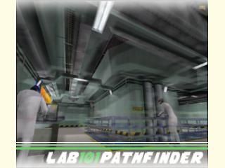
LaB101 - Update 1.4

Half-Life HL
LaB101 - Update 1.4 by mulleboy
Posted 20 years ago2004-07-27 05:46:19 UTC • Unfinished • Half-Life
Loading...
Screenshot Thumbnail
Name
LaB101 - Update 1.4
By
mulleboy mulleboy
Type
Map
Engine
Goldsource
Game
Half-Life
Category
Unfinished
Included
BSP
Created
20 years ago2004-07-27 05:46:19 UTC
Updated
20 years ago2004-07-31 08:39:55 UTC
Views
2552
Downloads
775
Comments
46
Download

1.2 -
Added:

-more gadgets <:)
-two more scientist
-fix for HD users
-fix for animation errors
-better pipes (smoother)

1.3 -
-Removod ugly compu room
-Added Speakers
-Added new hallway
-Added more detail to pipes
-Fixed a bit of the ligthning
-added some more ambient sounds

1.4 (latest) -
-Added some opaque to some entitys
-BUG: Opaque makes first room VERY bright
-Added Moominade Soda Machine texture by jaardsi
-Elevator doors in hallway
-1 more pipeway (upwards)

* Note that 1.4 is a very SMALL update *

46 Comments

Commented 20 years ago2004-07-27 05:52:58 UTC Comment #2944
Uploaded Twice...
Commented 20 years ago2004-07-27 06:10:33 UTC Comment #2946
A nice detailed (little) map.
shame about the scientist walking into the railings.
possibly think about making your pipes with a couple more sides, and try and give them flanges on each end that the connect to a wall. just adds realism.
Commented 20 years ago2004-07-27 10:39:01 UTC Comment #2951
The big with the sci walking right into the rails for ppl using High Definition pack now fixed.
Commented 20 years ago2004-07-27 11:08:34 UTC Comment #2952
Meh, I'm using hd but I don't experience any walking-to-rails at all.
Commented 20 years ago2004-07-27 11:22:08 UTC Comment #2953
I'n not using hd but I expeirenced it, its that sci that walks into it right on the screenie. Well, I liked it had good aritecture, the scientists looked good 4 some people. Maybe you should add some fans or something. I dont know if this was meant to be just a cool little detailed map, but maybe you could somehow work in a little fighting? Maybe in that empty room the light blows and u wake up in a destroyed lab and need to escape to the surface!?!?!??! :P
Commented 20 years ago2004-07-27 11:48:13 UTC Comment #2954
Good, but a few glitches and a bit pointless and small. Ok architecture, but you could do better. You have extreme potential to do better if you make a story and maybe a minimod out of this.
Commented 20 years ago2004-07-27 15:03:20 UTC Comment #2960
nice work so far, whats a flange?
Commented 20 years ago2004-07-27 16:54:32 UTC Comment #2967
pipe end bit..

or a pussy :P
Commented 20 years ago2004-07-27 21:12:54 UTC Comment #2976
I've been working on the 1.2 update on it for 1 day now. Thx for the pipe tips from async. Iv'e added flanges now, alhtough im not familiar with the word i think i know what you mean. Answer to Davideo59: Yes! This is eventually going to be a minimod and im working on it. the minimod will be version 2.5 then. Keep your eyes out for my other map: " STORAGE 919 ". Youll play as a Black Mesa disrubuting officer, then you will see what happends in the lower parts of BM when the disaster occurs :)
Commented 20 years ago2004-07-27 21:18:31 UTC Comment #2977
Architecture looks alright, although the walls seem kind of empty to me, especially around the Lambda sign. Decals or more computers might work. The scientist by the rail didnt do his scripted sequence, if he should be doing one, with a SD Model. Otherwise, pretty good.
Commented 20 years ago2004-07-27 21:25:00 UTC Comment #2978
The walls are supposed to be very clean. I do not want them filled with useless gadgets. If u were building an Secret Sciency Facility, would u build small ugly gadgets all ovr your wall for no reason, when u can easily compress them all in rooms with specifyed reasons?
Commented 20 years ago2004-07-27 21:27:37 UTC Comment #2979
Yes :p.

As long as there's a reason for them being clean it's alright.
Commented 20 years ago2004-07-27 21:30:52 UTC Comment #2980
Lots of ceiling detail and no wall detail. I think lots of "useless gadgets" would look good on that map actually.
Commented 20 years ago2004-07-27 21:31:26 UTC Comment #2981
Check out my new 0wnage Corridor for ideas on wall detail.
Commented 20 years ago2004-07-27 21:38:02 UTC Comment #2982
The walls are supposed to be very clean. I do not want them filled with useless gadgets. If u were building an Secret Sciency Facility, would u build small ugly gadgets all ovr your wall for no reason, when u can easily compress them all in rooms with specifyed reasons?
Commented 20 years ago2004-07-27 21:39:48 UTC Comment #2983
Oh! I happnd to post the same comment. Just ignore the one before this post
Commented 20 years ago2004-07-28 04:45:20 UTC Comment #2991
Better. I like the sci and his little electronics cart. The little machine by the pipes is good...but I think there's supposed to be a light in there...looks like there's a brush for one that has a non-lights.rad texture so its dark. Fix that.

The sci by the rail still doesnt lean on it with a SD scientist model.
Commented 20 years ago2004-07-28 04:46:38 UTC Comment #2992
Okey. I hate the Hl engine sometimes. 4 some ppl it's totally fine. no errors. for som... not. BAH!!! I'LL KILL MYSELF!!! AHHHHHH Paw! ...............................
Commented 20 years ago2004-07-28 04:47:43 UTC Comment #2993
doing!! boom!! pawash!! tumble-bumble!!
Commented 20 years ago2004-07-28 04:50:13 UTC Comment #2994
Well, don't do that....
Commented 20 years ago2004-07-28 04:55:11 UTC Comment #2995
do what?! doing!! boom!!
Commented 20 years ago2004-07-28 05:51:42 UTC Comment #2996
Very nice. I strongly suggest new textures, though. Custom ones. For a clean feel; those lab ones just don't go.

How did you make the animations repeat?
Commented 20 years ago2004-07-28 06:33:42 UTC Comment #2998
Thats becuase i took it as "idle" instead of "action"
Commented 20 years ago2004-07-28 08:04:53 UTC Comment #3001
veery nice map indeed.

although the scientist still insistes on doing the moonwalk :/

you got the detail just right, i think.
Commented 20 years ago2004-07-28 12:43:56 UTC Comment #3010
/me downloads.

Does the walls have any "useless gadgets" yet?
Commented 20 years ago2004-07-28 12:51:28 UTC Comment #3011
Ok, a nice little improvement. I noticed one small bug with the keyboard machine that the electronics cart guy was using. Underneath the keyboard there is overlapping textures. But it isn't a major problem. I like all the useless gadgets, but some walls are a bit empty. Look at my 0wnage corridor, all the walls have lots of detail. You should aim for walls not like that, but still very detailed. It may look a bit gay at first but when the players play the map, it will make them more amazed at your detail.
Commented 20 years ago2004-07-28 19:14:51 UTC Comment #3024
downloading now... looks cool. did you use 3.5 for the animations?
Commented 20 years ago2004-07-28 19:19:28 UTC Comment #3025
very nice. 1 flaw though, in the last room, sector 4, (i think) when i look to the left, everything is invisible except the entities! but minus the flaw i give it 4 stars.
Commented 20 years ago2004-07-29 04:59:35 UTC Comment #3032
I liked the architecture and details. Really nice. Lighting is good too.

However, with gl_wireframe 2 on, I saw a lot of entities still showing up, making me wonder about your VIS-process. You may want to keep entities not too large, otherwise they can spread out over several leafs, making it hard for the engine to determine whether they're visible or not. Often, they are then always rendered, even when they're not in visible leafs...
Commented 20 years ago2004-07-29 14:43:38 UTC Comment #3040
SD models are missing animations...you'll have to wait for a fixed version, or used Patched HD/LD models.

Architecture is very nice, but walls are empty.
Commented 20 years ago2004-07-29 16:46:58 UTC Comment #3047
Oh man :) This really warms my heart. All these suggestions will be tested in hammer and complied, and if any good... It's gonna stay there!!
Commented 20 years ago2004-07-29 16:59:10 UTC Comment #3048
Iv'e decided to make a kind of white look in the map. I like the LAB textures. actually.. I love them. Thats why im going to just overlay them with a nice white gradient.
Commented 20 years ago2004-07-30 08:14:49 UTC Comment #3062
Just forget about the white look :)
Commented 20 years ago2004-07-30 08:18:41 UTC Comment #3063
Okay, mulle, I'll comment. The architecture was great, and so were the scis. :P
Commented 20 years ago2004-07-30 08:25:52 UTC Comment #3064
thx :D
Commented 20 years ago2004-07-30 18:01:54 UTC Comment #3074
very nice, i download 1st version, 1.2 and now 1.3 it's grrrrreat!!
Commented 20 years ago2004-07-31 08:56:16 UTC Comment #3084
[pimp]Get the Moominade-texture from
http://koti.mbnet.fi/jaardsi/maps/texes/moominade_v1/
and use it in your maps![/pimp]
Commented 20 years ago2004-07-31 09:32:21 UTC Comment #3086
<Seventh-Monkey> MulleBoy: very nice map
<MulleBoy> :)
<Seventh-Monkey> I still really think you should change the textures though
<Seventh-Monkey> really nice architecture, but that green colour spoils it a lot
<Seventh-Monkey> the spawn room either needs more work or to be shrunk a lot
<Seventh-Monkey> and some stuff to do would be good (computers, easter eggs, cool stuff)
<Seventh-Monkey> only 4* 'cos've the texturing m'afraid
Commented 20 years ago2004-07-31 10:58:37 UTC Comment #3088
The moominade vending machine has no buttons... :P

Aside from that, nice additions.

Though r_speeds are a bit high. Probably because you've poured a lot of brushes into one entity, so that it's stretched over multiple leafs, so the engine renders the entity nearly always. I'd suggest using some more and smaller entities.
Commented 20 years ago2004-07-31 11:07:08 UTC Comment #3090
yeah, and think about changing the pipes, etc to func_wall or something.
Commented 20 years ago2004-07-31 13:06:44 UTC Comment #3092
EVERYTHING is func_wall except for the floor
Commented 20 years ago2004-07-31 14:18:08 UTC Comment #3095
There are no buttons cos that cunt didnt want to use em >:|
Commented 20 years ago2004-08-01 02:15:25 UTC Comment #3108
mulle: you shouldn't tie everything to entities as, even if you set them to cast shadows, it'll take longer to compile. Good lighting is more important, though - don't make walls with light streaming through!
Commented 20 years ago2004-08-02 16:04:45 UTC Comment #3120
Thx for that evil tip ! :P
Commented 19 years ago2005-04-18 17:46:55 UTC Comment #6834
+great architecture.
+nice texturing.
Commented 19 years ago2005-04-21 03:16:49 UTC Comment #6921
:)

You must log in to post a comment. You can login or register a new account.