tournament
 HL
HL
![[VDC] Rad Brad](https://twhl.info/uploads/avatars/small/315.jpg)
Loading...

- Name
- tournament
- By
-
![[VDC] Rad Brad](https://twhl.info/uploads/avatars/inline/315.jpg) [VDC] Rad Brad
[VDC] Rad Brad - Type
- Map
- Engine
- Goldsource
- Game
- Half-Life
- Category
- Unfinished
- Included
- BSP, RMF/VMF
- Created
- 20 years ago2004-08-18 03:57:04 UTC
- Updated
- 20 years ago2004-08-18 04:01:11 UTC
- Views
- 1997
- Downloads
- 778
- Comments
- 16
I have a compiled .bsp and associated files. The .wads are standard .wads. .RMF and .MAP files are also included. Nothing custom. This map is almost finished. It has some model problems, though. I have three models that I took from DoD and they aren't there ingame. I don't know if that's the nature of the DoD model, if I need to manipulate it, or if I am messing them up. They show up in Hammer and on my computer when I compile it. I guess it's possible that they're not uploaded to the server correctly, but I digress....
I am looking for critical review and some hard core "wh
I am looking for critical review and some hard core "wh
16 Comments
You must log in to post a comment. You can login or register a new account.
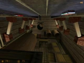
Well, the first thing that comes to mind is that the nature of the map tends more towards singleplayer than multiplayer. Highly-detailed, over-detailed at several area's (resulting in bad performance). Connectivity seems ok at most places but some area's would lend themselves better for SP, like some small dead-ends (the kitchen for example. You're not going to chrouch-jump over that obstacle to get that gun, only to find yourself being trapped in there by some grenade-launching player).
Texturing let you down, especially in the industrial area. Lighting isn't really special but not bad either. Try some variation with dark spots maybe.
The office-part doesn't seem to work together with the industrial part, they don't fit together the way they do now. Maybe create an outside part and have them in two different buildings?
Another thing is the interactivity. It's nice and fun but I feel it's not practical here. Look at crossfire, that air raid affected the gameplay in a nice way. Here, your tricks seem to distract from gameplay. At a certain moment I thought those wheels would be turnable too, only to find them being just details... Also, doors that open very slowly break down the pace of the game. Players want action, and want it quick. Such doors are a pain when you're fraggin'... unless they're well implemented, like as an access to a super-weapon or such.
Performance in this map was a bit low in some area's and I don't see hint brushes taking that away. Cut down on details, you need to.
Another thing: there was a door, next to the red bath, that was especially hard to navigate trough. Something that needs to be fixed.
And the music, I liked it. Too bad it's only heard a very small part of the map... I'd say you should make it a background music for the map or throw it out, as it adds quite a lot to the downloads filesize...
As for the models, they showed up just fine by me, maybe you don't have those transparancy dll's?
(Oh, and you've included all files needed to play, so that's no problem. Yeah, I've seen your first description... ;))
1. Eye Candy. Adding detail with architecture, sprites, models, sounds, and other entities. My other maps were "blah".
2. Build a map that wasn't two dimensional. Like Datacore, this map has it's semi-ups and semi-downs. I wanted (and had) two outside areas, but it wouldn't handle it.
3. Keep a texturing theme, possibly create a texture theme from scratch. Had too many other problems to add textures to it, but I did learn alot about Wally and models in general. By the way, I have the transparancy .dlls in my old won folder. I can see the models when I test run the map, but I loaded it onto a commercial game server and nobody could see them.
4. Skip brushes. I don't think you looked in the .rmf because I wasn't wondering if I needed more, per se. I was wondering if the ones I had were placed relatively correct. But I did use skip brushes.
5. Trains. The cut away parts of the map had two trains running, one a target, one attached to an env_beam, with random path_corners in the sky and on the ground. So I learned alot about it... you don't get to see it, though....
6. Texture lighting. I haven't extensively used texture lighting, and I think everything in this map is lit with texture lighting. Not well, mind you, but it's there.
7. Low r_speeds. I was shooting for 95% of the map to be 800 or less.
I will keep working at it, but I'm really getting sick of this map. Which doesn't help the "perfection" part.
1. The first thing I saw was that your brushes didn't align to the rougher grid-sizes (16 units for example). To me it seems you either use a very small grid size or you don't have Snap to Grid (Shift + W) on. I would really recommend this as it makes maintaining the map easier as well as preventing leaks. For detail brushes you would then switch to a smaller grid size (using the [ and ] keys).
2. As you may have mentioned somewhere, you covered the outside of the map with the 'null' texture. Next time, don't do that, the compile tools will cut away those faces anyway, so it's a waste of time.
3. Lots of face-consuming details, you should cut on them. Those cilinders could do with less faces, and those stacks of wooden plates could be made one cube, with some good texture usage you could simulate a stack.
4. The layout allows the player to see too much of the map at once. Hint brushes aren't going to avoid that here anymore. Maybe a radical change in the layout is the only way here...
As in reaction to your points:
1. Eye candy doesn't cope well with open layouts. It's either one or the other, or a trade-off between both.
2. You succeeded in that.
3. The textures in both area are consistent although I'm not too sure about those computer textures in the industrial site. Overall, texture usage isn't outstanding though. They make the map look so unrealistic, especially the industrial area. The office is done better, the textures 'work' well with the architecture.
4. The 'hint' brushes seem te be placed correct, but they do not align up well. See the first point of this post. It may not be absolutely necessary but I saw several thin faces in wireframe mode (type 'gl_wireframe 1' in the console) wich I think could be avoided.
5. Wouldn't it be better to test such things in small test maps? Compiles a lot faster and doesn't mess up the map you're working on... just my thoughts on it...
6. I understand you've learned a lot. Your map hasn't failed. Although you're getting sick of it, you've learned a lot of it, and so it has served a good purpose. Reminds me of the several half-finished HLDM maps I made... put a lot of work in them but never finished them as they just didn't play well.
7. Try to keep that other 5% below 1000 then. A note: area's that often see combat should have a more thight w_poly limit than area's that barely have combat in them. Not only the player models have impact on the fps but also the combat calculations, although I'm not sure how hard this impact really is.
8. The kitchen... I'd say run some playtests and see if it worked the way you planned it, or otherwise. Then decide if it's enhancing the gameplay or not.
Well, I hope this is helpfull... since that's a lot of text...
Many of the entities, like trains, were tested in small maps. I just didn't mention it. many times I use the cordon tool to create a .map of that area, if I've gotten creative without switching to a small test map.
Textures- I would do well as half of a team of two mappers... one who builds and one who textures. I hate texturing. I would build...
The hint brushes I kept thin because some tutorial somewhere (and poosibly these forums) mention that only the side marked hint is used during the compile and the rest of the brush did nothing, so it didn't matter how big it was... as long as the side marked hint intersected the brushes around it. I don't really know if that's true or not.
I did try to keep the other 5% below 1000, and if you'd seen the r_speeds before I adjusted things (5500 in one spot, since deleted), I'm happy I was able to have only a few spots above 1000. I'm also unhappy I have a few spots above 1000. Conflicted, I know.
Lastly, I map with the grid set to 1 and I only change it (with the [ and ] keys) if I need to move something a long distance in one direction. And I size it back to 1 before I set it in it's final spot.
Heh, true... I'm texturing now and then but I feel it's not really my thing. It takes lots of time for just a few textures, and often I'm not satisfied with them. Maybe it takes just more time to learn than mapping did...
You're right about the hint brushes, only that side is used. Beware though with using them, often they have no impact, only cases were otherwise too much would be rendered unnecessary. An important thing to know is that compile times can increase exponentionally, so only use where necessary. Read this:
http://www.gamedesign.net/book/view/266
Very helpfull, and although for Quake, the principles are the same.
I had some performance issues on this map now and then, it ran on 40 fps (system specs: AMD 1800+, 384 MB RAM, GeForce FX5600) at some spots.
It's a layout issue here. I'd suggest drawing out a layout first, think about what area's have line of sight to each other, then test it. After the rough layout is made you know what area's allow for more detail as they have low r_speeds, and what area's are best left less detailed as they already have higher r_speeds.
Another thing I noticed when I looked trough it again was texture stretching. Try to keep the scales equal, preferrably 1x1, this makes them look better.
Oh, and while you do pay attention to detail, several surfaces were flat and boring, with nothing to break up the monotome texturing. Something I often fail on too, but it could be improved on.
Heh, and I like to give some beta-comments. Nice you like it. After all, I need betatesters too now and then and it's indeed a powerfull way to improve.
I have creativity issues. I have a hard time drawing maps out ahead of time. Though, thinking about it, my other map, Courtyard2, compiled in 8 minutes... I drew that one out.
And texture stretching is mostly a product of the "fit" command.
I'm old enough now that I'd rather improve than be right.
The map has been re-textured, but it's still disjointed. I have been asked to rip Crossfire apart and re-construct a variation of it for a tournament coming up in the next month, so this map went on hold. I am almost finished with that project, though, so I'll be back on it soon!
And thanks for checking back. I appreciate that!