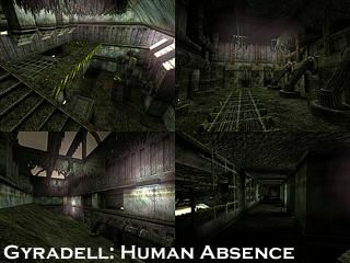
Gyradell: Human Absence
 CS
CS
Gyradell: Human Absence
by
Rimrook
Posted 19 years ago2005-04-30 03:38:47 UTC •
Completed •
Counter-Strike
- Name
- Gyradell: Human Absence
- By
-
 Rimrook
 - Type
- Map
- Engine
- Goldsource
- Game
- Counter-Strike
- Category
- Completed
- Included
- BSP
- Created
- 19 years ago2005-04-30 03:38:47 UTC
- Updated
- 19 years ago2005-05-01 14:22:01 UTC
- Views
- 4893
- Downloads
- 1117
- Comments
- 19
- Rating
- 5.00 (1)
- Reviews
- 0
Pretty much i was messing around with photo shop and was playing with textures. Then suddenly, BOOM i had a map. A few notes is that i found a wierd method of construction that i never knew about before, and it makes texturing easier.
There are actually 4 bomb locations, each spread throughout the large dynamo by the ct spawn. pretty much plant the bomb anywhere in that room and watch the ct's scramble around looking for it.
The T spawn area looks like a miniature AIM_MAP to me... but whatever.
UPDATE: Better fog sprites, humab.wad included
19 Comments
You must log in to post a comment. You can login or register a new account.


I like!
Yes, it is regular cs, not cs:s.
Please share further, for all us learning texturing.
EXAMPLE: Like if you have a series of walls and you want to add a trim to the top or bottom. Select all of the walls you want to clip and split the brushes as you please. Then simply retexture the split brushes. This can save time on the tedious manner of adding one brush at a time, or even works easily when putting in a door frame or a hole in the wall. It has many uses. I'm many of you already knew about this feature of the hammer editor.
If this isn't clear, i could write a tutorial about it or something.
Ok, for the map, one of your most interesting yet IMO. The subtle fog effects inside were flawless, and the wind tunnel room was also quite amazing. The rest of the map kinda paled in comparison.
One thing I've noticed with a lot of your maps is you tend to stick to a pretty limited palette all the way through. Though this makes the map blend, flow together, and transition better, it's sort of tedious after while IMO.
Maybe an off color hear or there to mix it up??
Overall, really good. Againe, I was blown away by the fog/haze sprites in this map....perfect!
The shortcut for that is to just use Shift+X, which is the shortcut for the clip tool. Use the shortcut twice (assuming you just went into the clip tool) to easily go into the split-brush mode.
I figured someone knew about the clip brush thing
I do use a short variety of textures to cut down on the filesize but wasn't expecting a filesize this low.(831.8 KB)
I didn't included my custom sprite for fog/haze either, which looks much better than the HL sprite i used. I'm gonna reupload this with the sprite fix and include the wad i used. Maybe somone can use my wad to make something.
I also hinted it to reduce r_speeds a little.
Added a new fog sprite that looks better.
Included the wad i used
Great job Rimrook, you seem to have a great future in this industy ahead of you
Puting a brush--tied to func_illusionary turned pepindicular to the convyeors and wide enough for the entire room, may hide the gridwork.
It's really a minor thing, just thought it might improve it a little.
**--- (36)
Downloads: 33
o__O
Edit: Goes back 7 years and give's Rim five stars to help balance stupid ratings.