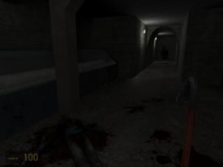
Beginning
Version 3.2
This is probably my last update, made a skybox, added some more detail, did some optimization.
For those of you who dont know, this is my horror map based off what I've played in Resident Evil. Have fun!
This is probably my last update, made a skybox, added some more detail, did some optimization.
For those of you who dont know, this is my horror map based off what I've played in Resident Evil. Have fun!
13 Comments
You must log in to post a comment. You can login or register a new account.

 HL2
HL2


+ Nice spotlights, though the halos are a bit big
+ Claustrophobic feel
- No plot
- No sense of place. Needs a specific setting with appropriate architecture and detailing.
- Bare rooms, some with strange furnishings e.g. sofas in a concrete bunker.
- Monsters seem to be in need of some nodes.
- Ending wasn't good because the gman didn't say anything- but that's easy to do.
BUT although there are more negatives than positives you have obviously grasped the basics well and with a bit of plot and some more detail I am sure you will create fine maps!