dm_crete
 HLDM
HLDM

dm_crete
by
Rimrook
Posted 19 years ago2005-09-02 11:42:40 UTC •
Completed •
Half-Life: Deathmatch
Loading...

- Name
- dm_crete
- By
-
 Rimrook
 - Type
- Map
- Engine
- Goldsource
- Game
- Half-Life: Deathmatch
- Category
- Completed
- Included
- BSP, RMF/VMF
- Created
- 19 years ago2005-09-02 11:42:40 UTC
- Updated
- 19 years ago2005-10-25 12:14:24 UTC
- Views
- 6887
- Downloads
- 1231
- Comments
- 17
- Rating
- 4.29 (7)
- Reviews
- 0


UPDATE: .rmf is now included.
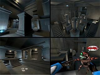
This map is made using only one single texture and no angles... Besides the lights. I didn't check the R_Speeds so i bet they are murder. It performed fine on my PC. I know it's blocky, it's supposed to be.
~Enjoie!
This map is made using only one single texture and no angles... Besides the lights. I didn't check the R_Speeds so i bet they are murder. It performed fine on my PC. I know it's blocky, it's supposed to be.
~Enjoie!
17 Comments
You must log in to post a comment. You can login or register a new account.
:downloading:
+Architecture
+Using 1 Texture
+Lights
+Weapon Placement
but i didnt like the gameplay somehow,it looked pretty boring to me with 1 texture.
+ Light
+ Weapon placement
+/- Gameplay
- 1 texture
Nice map though!
Even though it uses one texture, the important thing in this map is lighting. Different colors and contrast supply the richness and variation that in other maps are done with textures.
It kind of reminded me of my map "Floating Point" in that sense
There are nice jumping puzzles, some of them similar to things you can find in the first Tomb Raider. Gameplay would surely be affected by this, sometimes negatively as you would often get killed while doing some careful jump...
R_speeds are indeed very high, but these days we dont really notice. The light_spots placed under each item might be too numerous, but I remember when you told me about the difficulty to find things in my map "Guardian".
Some brushes should definately be func_walls, but this is still a very nice map.
but with only one texture there is only one question... why?
Made in 2 hours just for pure enjoyment, try it sometime.
"but with only one texture there is only one question... why?"
I noticed that i try very hard to crispen up my textures so they look sharp and detailed, but they look blurry all of the time and i seem to never be satisfied with the result. However, the single texture idea frees up the tediousness of adjusting textures, making textures, making it try to look right with textures, etc. the element of that was taken out in this map, and utilized the sharp edges of the archetecture to define the detail as well as the contrasty ambient lighting. It was fun to ignore the textures and have some fun mapping for a change. it didn't feel like work and it tuned up my brushing skills in terms of design. I did notice that people don't get detailed with small brushes and edges very often, but this adds so much flare to a map in terms of detail. So many people are worried about their map looking good that the basics of design are being forgotten. I would gladly suggest everyone at TWHL to map something like this, it's a very good excercise for source and non-source mapping alike. Don't worry about the r_speeds too much either, just keep them under 2000
Review:
****************
+ Architecture.. That's what made the map look good with only 1 texture everywhere.
+ Lighting. Gold. You actually managed to make a map with one texture look good with great lighting..
+ Layout. It was ok. Lots of spots to jump on, hide in..
+ Gameplay. Great. Great wpn placement. I really enjoyed jumping on those pillars, and other stuff... great.
********************
- Ambient sounds. Such a great map could have used some... :
***********************
In total - this map really shows, how good you are at mapping. I mean c'mon! The damn map had one texture all over and looked great!!
Have fun... you'll need it...
geh.
I loved the layout, the point-based lights for each weapon was neat, and I loved the amount/placement of them.
Looks like a fun maximum carnage map. The only thing I can think of that would be missing would be sound, but I'm at a loss myself to figure what sort of sound would be good for this.
First DM map I'm rating 5 stars.
Great job Rimrook!
It's a shame I cant test it with my friends. Maybe one day.
5 stars for great minimalistic design.