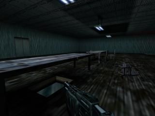
Jasons Rock, My First Real Map

Half-Life HL
Jasons Rock, My First Real Map by quiet_girl86
Posted 19 years ago2005-09-03 22:33:30 UTC • Unfinished • Half-Life
Loading...
Screenshot Thumbnail
Name
Jasons Rock, My First Real Map
By
quiet_girl86 quiet_girl86
Type
Map
Engine
Goldsource
Game
Half-Life
Category
Unfinished
Included
BSP
Created
19 years ago2005-09-03 22:33:30 UTC
Updated
19 years ago2005-09-26 21:31:57 UTC
Views
2280
Downloads
591
Comments
19
Rating
4.00 (2)
full star full star full star full star empty star Download (86.9kb)

This is the first REAL map i've made. There really isn't much point to it yet except for the fact that i made a button work all by myself! haha i know it's super easy and stuff...but it made me happy. ^.^

BSP now available!

EDIT: I've done a few more things to the map...I'm sorry if it's annoying to repost the same map...if it is, please let me know.

19 Comments

Commented 19 years ago2005-09-04 04:27:19 UTC Comment #8848
Hey, for a first map that was excellent! And no, im not trying to be nice, that was genuinly really good for a first map! Those tables where good, the lighting was interesting and the light fitting from the roof was very nice too. And also the elevator with the switch was clever. For a first map I give you 5 stars! Everyone else's first map was a one textured full-bright room with maybe a gun lying on the floor. This map actualy had detail and good lighting. Well done ;)
Commented 19 years ago2005-09-05 23:16:14 UTC Comment #8883
Yeah, pretty darn good for a first try.

Try changing the color of the light in your next map, and also rotate the tables and other objects in your map slightly so not everything is orthogonal to each other.
Commented 19 years ago2005-09-06 00:04:03 UTC Comment #8884
Look good for the first try I'm downloading it!
Commented 19 years ago2005-09-06 00:07:52 UTC Comment #8885
Thank you all! Thank you for your encouragment and advice! I'm going to make sure I use it to its full potential. :)
Commented 19 years ago2005-09-06 00:09:26 UTC Comment #8886
Don't use capital letters when naming maps/entities.
Commented 19 years ago2005-09-06 00:11:50 UTC Comment #8887
Also use simpler names! You could have named the bsp file "jr".
Commented 19 years ago2005-09-06 00:13:08 UTC Comment #8888
Ohh...I didn't know..I'm always bad with names anyway. Thanks...i'll keep that in mind :)
Commented 19 years ago2005-09-06 00:18:48 UTC Comment #8891
Ohh...it's an RMF thats why I couldn't play it! Whoops
Commented 19 years ago2005-09-06 01:20:26 UTC Comment #8894
Ok how did that heppen it posted the samething three times!
Commented 19 years ago2005-09-06 17:41:29 UTC Comment #8909
I'd prefer a .bsp file over a .rmf... ;)

Actually, I think it's good for a first map. My first one was a L-shaped corner... not that I ever showed that to anyone except for my family, but hey... ;)
Anyway. There's a leak in the .rmf you uploaded. I'd recommend mapping with Snap to Grid on, and using a rough grid size for the base architecture (something like a 32 or 64 size). It's easier to prevent leaks that way. When dealing with detail, you can switch to lower grid sizes quickly with the [ and ] keys.
Give that ladder a Render FX - Solid, and a Render Amount - 255 to make the black parts invisible.

Other than that, keep going, and post .bsp's next time. :)
Commented 19 years ago2005-09-19 00:41:17 UTC Comment #9069
include the bsp i cant dl it now i will later tho
Commented 19 years ago2005-09-20 20:19:13 UTC Comment #9085
Looks interesting, im downloading it!
Commented 19 years ago2005-09-20 20:32:34 UTC Comment #9086
It's a first map, great job :)

I liked the details!

Im giving you a 3 of 5, just for motivation to be better ^^

Good luck!
Commented 19 years ago2005-09-21 07:50:09 UTC Comment #9088
Thank you! Motivation is always welcome! I appreciate it! ^_^
Commented 19 years ago2005-09-21 09:06:07 UTC Comment #9090
Just keep on mapping, i want to see more from you :D
Commented 19 years ago2005-09-21 18:50:08 UTC Comment #9103
Include .bsp for the lazy ones like me!

the upturned chair looks nice from the screenie ;)
Commented 19 years ago2005-10-26 08:09:04 UTC Comment #9594
Thank you! ^^
Commented 18 years ago2006-01-07 21:45:49 UTC Comment #10402
Neat stuff, especially for a first map!

I liked the detailed chair pushables and the tables, and the whole place reminded me of my freind's hunting cabin! I also liked how random this map is, sort of like letting your subconsious flow into hammer, at least that's what it made me think of. Interesting red lighting too, and the flickering reminded me of lightning!

Nice job!
Commented 18 years ago2006-01-10 14:23:21 UTC Comment #10425
Thanks! Your detailed description of my map made me want to play it haha. I haven't been on this site or made a map in sooo long...i feel terrible about it.

but thank you for your compliments! :)

You must log in to post a comment. You can login or register a new account.