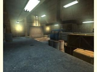
DM_Combination
 HL2DM
HL2DM
DM_Combination
by
Cpl.1nsane
Posted 19 years ago2005-10-25 11:45:54 UTC •
Completed •
Half-Life 2: Deathmatch
- Name
- DM_Combination
- By
-
 Cpl.1nsane
 - Type
- Map
- Engine
- Source
- Game
- Half-Life 2: Deathmatch
- Category
- Completed
- Included
- BSP
- Created
- 19 years ago2005-10-25 11:45:54 UTC
- Updated
- 19 years ago2005-10-25 11:45:54 UTC
- Views
- 2442
- Downloads
- 1217
- Comments
- 1
- Rating
- 4.00 (1)
- Reviews
- 0
The Deathmatch map i made for Trapts HL2DM Compo
1 Comment
You must log in to post a comment. You can login or register a new account.


The entry featured the best RPG trap. It was difficult to reach, and although not incredibly dangerous to get, it worked very effectivly. The entrance to the trap was easy to find, but not incredibly obvious, meaning that the adventurous players should find it quickly.
Overall, a beautiful map which was spoilt by bad gameplay decisions such as doors.
4 stars