Xaves

Half-Life HL
Xaves by alexb911
Posted 19 years ago2005-10-27 16:49:02 UTC • Completed • Half-Life
Loading...
Screenshot Thumbnail
Name
Xaves
By
alexb911 alexb911
Type
Map
Engine
Goldsource
Game
Half-Life
Category
Completed
Included
BSP
Created
19 years ago2005-10-27 16:49:02 UTC
Updated
19 years ago2005-10-27 16:49:02 UTC
Views
3106
Downloads
826
Comments
18
Rating
4.00 (6)
Reviews
0
full star full star full star full star empty star Download

xen_tranportation01
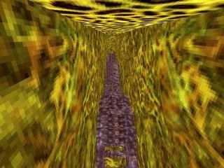
Yes, the screey sucks, yes the lighting sucks, but its the idea I want feedback on. This was my Xen Transportation enter, but due to a recent pm (you know who you are!) I decided to post this to get any comments, and then hopefully make something more of it, maybe incoperate into a mini-mod set in Xen, something rarely seen.

Therefore, please give your comments. I know you may have already downloaded it from the compotetions screen, and I have not updated anything since that version.

Thanks alot guys!

18 Comments

Commented 19 years ago2005-10-28 04:53:50 UTC Comment #9628
so... should this not go in 'unfinished stuff'

judging from screenie, poor architecture. too bright (fullbright?) and lacks xen feeling
Commented 19 years ago2005-10-28 06:54:12 UTC Comment #9629
First of all it's not fullbright. Second of all, it does have a xen feeling. Maybe you should download things and not judge from screen shots?

The idea is awesome, I've never seen something like that before. I had the urge to try to jump into the waves as opposed to on them, but the opening was too small. :( Oh well. Maybe try adding some low gravity. It was pretty short, I must admit, but I think if you cleaned it up a bit and made the caves less like a box, then it would fit perfectly into a xen mini-mod. 4 stars for the idea.
Commented 19 years ago2005-10-28 08:35:45 UTC Comment #9631
I really liked this idea as it mimicked an organic transport tube really nicely, but the looks of it pulled me off and the somewhat troublesome workout works against it too. I got stuck several times, almost killing me.

So, the idea is good, if it was for the idea only I think this was the best one, but the workout let it down a lot.

Oh, and you run in software mode? Why not OpenGL?
Commented 19 years ago2005-10-28 09:26:08 UTC Comment #9632
recently formatted computer and reinstalled half-life, etc. obviously forgot to change the settings.
Commented 19 years ago2005-10-28 10:20:53 UTC Comment #9633
wel alexb911. I first downloaded this from the compo just after it ended. I and was impressed. Its a really cleaver idea and obviously took a while to produce. The map is definitly not fullbright, as 'I' have played it.

Hunter, at least leave structured comments that will be of use to the creator. Dont judge a book by its cover is all i would say.

The idea is great, even if the screenshot doesnt show the whole picture. Nice work, far better than my entry for the compo!!!
Commented 19 years ago2005-10-28 10:21:22 UTC Comment #9634
i forgot to rate^
Commented 19 years ago2005-10-28 10:27:51 UTC Comment #9636
thanks a lot. this is definately compelling me to make a greater feature of this. imagine a network of these. imagine the fps! 10 - 15!
Commented 19 years ago2005-10-28 14:01:53 UTC Comment #9639
Wow... that was original! it must have taken ages to do that...
a neat effect
Commented 19 years ago2005-10-29 05:19:51 UTC Comment #9651
I liked the idea but the artitecture was bad and the lightning was bad. As I said before great handling of those func_rotating entities.
Commented 19 years ago2005-10-29 15:05:40 UTC Comment #9658
Awesome idea,
really intuitive -although player does get stuck an awful lot in places. Especially when you drop down to the next level .
Elon I think he was trying to focus emphasis on the wave, not so much every thing else around the player. As he States [" maybe incoperate into a mini-mod set in Xen, something rarely seen. "]
I say go for it, it's somthing different!!!!!!!
Commented 19 years ago2005-10-29 15:39:03 UTC Comment #9662
@Hunter: The screenie does not do this map justice, as is many times the case with maps. This you should know by now.

The getting stuck problem is obvious, buy when you 'fall' through the right way, it creates an exquisite, original effect, that I can safely say blew me away.

Sort of like waves and gears. I like how you can ride atop the wave and fall throught too.

@Alex B: Please tell us what inspired you to create this effect!

The rest of the map was quite well done, if not a little short. I'm giving this one *** for sheer origianlity.

Nice Job!
Commented 19 years ago2005-10-29 17:10:30 UTC Comment #9663
cheers all. if got exams in 2 weeks, but after that, I will definately start something. what inspired me? not sure. i think I was messing around with rotating objects, changed the start delay, and realised that it carries you. it is practically impossible to go backwards!
Commented 19 years ago2005-10-30 07:37:30 UTC Comment #9669
are you in year 12 alex?
Commented 19 years ago2005-10-30 08:35:04 UTC Comment #9670
nah, year 11, an about 1/2 way through it.
Commented 19 years ago2005-10-30 09:22:56 UTC Comment #9671
Actually, it reminded me of an old idea I had years back, which in turn I've seen as a level theme in some games: the inner organs of a creature. It's pulsating, it feels alive and just like certain organs it's a transport tube. I would've played with func_trains to achieve such an effect though as I think clever shaping and use of these would give about the same effect but be much less prone to getting-stuck problems.
Another thing I would've done was modelling parts of the map and animating them to achieve a pulsating and alive effect.

Maybe that's an idea if you're ever going to use this again?
Commented 19 years ago2005-10-30 10:05:29 UTC Comment #9672
thats what I was thinking at first, but realised I didn't have enough time. I thought of a living world sort of swallowing you, which I think is represented well when falling down, although not so much going along. thats for that idea captain p though, that would definately make the 'living thing' look more realistic!
Commented 19 years ago2005-10-30 16:43:28 UTC Comment #9679
Thats exactly what I said the idea is awsome and also the setup but the other stuff were very poor and made it lose in the compotition.
Commented 19 years ago2005-10-30 20:10:14 UTC Comment #9681
yeah... i agree with you. im annoyed now as I can see now that my other entry was pointless. it was a teleporter, and obviously, at that stage in my mapping career, even my teleport (a crap and old idea anyway) would be beaten by anybody elese teleporter! IT SUCKED!!! maybe if i spent all my time on it I may have got a medal... hind sight ehh... a wonderful thing!

You must log in to post a comment. You can login or register a new account.