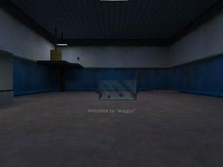
Mappy
Screenshot's kinda shoddy.
Yes, it is a n00b map (hence the boxxiness of it) but it's also a map I used to test various things (like architecure and fancy teleportinators). I wanted to put it in Example maps, but I was afraid it would get deleted. Anyway, I put it up here because I wanted to do something with it, but I don't know what. I'm leaning toward a DM map, because there seems like there's a lot of cover for players to hide behind. What do you think?
Two notes: You can turn the radios on and off, and I do realize that the sci typing on the laptop's hands go through it. I just got fed up trying to reposition him and the table.
I've also included the RMF of a map I made (tut1.rmf) while following the "In The Beginning" tutorials, just so you know I didn't start without practice.
4 Comments
You must log in to post a comment. You can login or register a new account.

 HL
HL


I like it
Hilarious announcememts, text, and I loved the post-it!
- for very blocky architecture--especially the main room, but I have a feeling you'll be improving fast. Also, no space ship in the universe would I envision so square, but In zero-G, I suppose it doesn't matter much
+Minimod format! very refreshing!
+Love the radios
+Texturing and lighting was pretty good, albeit a little plain in the main room.
+neat little remote control thingies and laptop
Very enjoyable map for what it is. I see 5-stars in you future endeavors!
Ambiece was cool too--which most all maps omit intially.