hldm_milivolt
 HLDM
HLDM

hldm_milivolt
by
rend0us
Posted 19 years ago2005-11-09 11:34:52 UTC •
Completed •
Half-Life: Deathmatch
Loading...

- Name
- hldm_milivolt
- By
-
 rend0us
 - Type
- Map
- Engine
- Goldsource
- Game
- Half-Life: Deathmatch
- Category
- Completed
- Included
- BSP
- Created
- 19 years ago2005-11-09 11:34:52 UTC
- Updated
- 18 years ago2006-07-28 23:04:06 UTC
- Views
- 1680
- Downloads
- 660
- Comments
- 9
- Rating
- 4.33 (3)
- Reviews
- 0


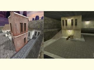
An attempt to clean up hldm_center. Let me know which version is preferd.I hope all enjoy it, tks all...
$1REN
$1REN
9 Comments
You must log in to post a comment. You can login or register a new account.
The problem of using detailed textures is that the whole map needs a high detail level in every aspect.
The usual dilema of: why do textures look realistic but a lot of things in the map look strange?
This map would be really easy to fill with props in HL2DM
Although the map still looks empty, as Kasperg said.
I don't see much changes in this version, the textures were nice, imo.
Just one big problem:
The r_speeds go up to 1.5k in some areas and that's too high for a HLDM map.. Try hint brushes or null textures.
Anyways - the map still needs ambience, and I'd still change the theme of the secret room with the ammo.
List the changes, perhaps?
Great map anyway!
The layout is now more straight-forward and the texturing is really improved but you still got the problems with the dead ends, doors, stairs and windows..
Like daubster basicly said : THIS MAP NEEDS AMBIENCE!!
Also, this map suffers from emptyness, yet, more space, more action
Still getting 3 stars..
+ Artitecture was fine. Nice houses, gives a feeling of a quite little villige.
+ Texturing was neat. It adds lots to the atmosphire of the villige. Really great costum textures.
+ Good weapon placment. The weaponry and the ammo aren't too close to each other. And it's not to easy to get to the strong weaponry.
+ Gameplay was fine, mostly because of the layout. There is enough room but there is also very little cover.
+ Lighting is sometimes bland but mostly interesting. Try adding more colored lights, change the light from the sky to orange.(since it's in the dusk) Or atlist change the sky.
+/- Neat layout, easy to learn. To bad about the dead end.
- Add some more detail. This map is empty.
- It lacks of ambience.
Don't use breakables in HLDM. For the windows I advice you to use illuosnaries and over them place a clip brush, so the player can't pass them but can shoot through.