hldm_center
 HLDM
HLDM

hldm_center
by
rend0us
Posted 19 years ago2005-11-01 21:11:14 UTC •
Completed •
Half-Life: Deathmatch
Loading...

- Name
- hldm_center
- By
-
 rend0us
 - Type
- Map
- Engine
- Goldsource
- Game
- Half-Life: Deathmatch
- Category
- Completed
- Included
- BSP
- Created
- 19 years ago2005-11-01 21:11:14 UTC
- Updated
- 18 years ago2006-07-28 23:05:27 UTC
- Views
- 1958
- Downloads
- 711
- Comments
- 21
- Rating
- 4.00 (5)
- Reviews
- 0


Improved version here: hldm_milivolt
another hldm map. i hope all enjoy, please post opinions and ratings, tks all...
another hldm map. i hope all enjoy, please post opinions and ratings, tks all...
21 Comments
You must log in to post a comment. You can login or register a new account.
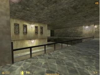
The map has open areas and interesting layout.
Ceilings need some height variation though.
There are some dead ends (the lower level that we can see in the screenshot)
Lighting is OK, but the outside light is too bright for my taste. After all, "Architecture is the combination of volumetric figures bathed by light"
And for all those would be Juju's who contend texturing isn't a core part of mapping, I suggest you take a look at this map. The textures in this map make it appear to be Source engine derived!
The sheer beauty of the textures on this map make me wish there were a sixth star to award
Also btw this map gave me deja vu multiple times while walking through it. Is this map of a real place?
****************
+ Architecture. Not too complex, not too simple. Almost perfect for a HLDM map.
+ Texturing. Looked very nice. Torn-style textures relly fit the theme.
+ Layout. Great layout, great idea with the windows, although some of the windows' finc_breakables had glass for a material, not metal. The secret room with ammo was also fun, but it would be much cooler if that room would have been with the same theme as the map. The lab theme kinda sucked, imo..
+ Gamaplay. Great wpn placement. Almost perfect! It just needs more healthkits.
+ Lighting. Bright outside, gloomy inside. I like it.
+ Idea. It's very original for a HLDM map, because most of the HLDM maps are lab/industrial/military - style. This is something different for a change.
******************
Overall - a great map. Why not post a better screenie? This one looks really poor..
Weapon placement was a bit overdone if you ask me, but maybe that turns out to give some frantic combat, playtesting should tell there. I do think it lacked some medipacks but armor was good available.
The doors would've been better left out, or open on touch. Right now they take out a lot of speed from the game. Some staircases are too steep as you fall off them rather than descending. I think those building insides are too small for the combat that the overload of weapons will give, and the map is generally small but at the other hand very easy to learn.
I'm dubbing a bit about the look of this. Some problems like a too small maximum view distance and the already mentioned wrong gib type for the windows could get fixed though these are minor points. Anyway, the textures look good for this map but some area's look too boring with long surfaces that didn't really fit the area well, and some other areas looked a bit too cramped. I don't know, I think the several aspects don't really work well with each other yet. I think the lighting is ok but nothing outstanding.
Maybe it's the fact that it's supposed to look like a city, but feels very limited (e.g. no road that leads outside like in de_torn and not really a fitting sky for a city) for that theme.
Oh, and more of a technical thing: the .res file lists a lot of files that aren't custom. Afaik, you only need to list custom files. Resgen doesn't do a very good job if you ask me...
And, in case you zip custom files with the map, please zip their folder structure as well so it's easier to know where to place files.
Texturing needs a lot of work, they don?t really fit with the brushes and looks like that they don?t belong in some places.
another thing, in that yellow house, it was windows on the outside, but not on the inside?
But the design was not HLisch and that is GREAT! the weapon placement was ok, and the light was ok.
It?s going in the right direction but needs more work
Giving 2* for a really good map?
Aw well.. Tiz your opinion.. :
I understand that a lot of people think this is a really great map
But i think it sucks (sorry but im just being honest)
It wasn't realistic as it was meant to be and he could have done a far better job if i worked on it harder
On first, I think the doors and small rooms will ruin the gameplay actually.
The doors should be removed or go open on instant touch.
The building rooms would be to small to avoid attacks and run around in.
Also, the stairs were pretty fucked up, you could fall of very easy.
Dead ends are also very anoying, unless there is a health recovery placed.
These things ruin the speedyness of the game and as we all know, hldm, is very fast paced.
The weapon placements wasn't really good either.
The good weapons were to close to each other.
Armour was well balanced and Health was also well balanced in my view.
The texturing was alright, some textures didn't fit with each other.
The lightning was nice, but a bit boring on the other hand.
Architecture was basic, wich is good.
3 Stars.
Added to the OutPost-42 HLDM server last night..
you can get it here^^^^