Water Burials
- Name
- Water Burials
- By
-
 IMUS
IMUS - Type
- Map
- Engine
- Source
- Game
- Half-Life 2
- Category
- Completed
- Included
- BSP
- Created
- 18 years ago2005-11-22 16:45:13 UTC
- Updated
- 18 years ago2006-10-29 21:22:18 UTC
- Views
- 3471
- Downloads
- 1189
- Comments
- 3
- Reviews
- 0
A HL2 SP map where Freeman has been dropped in to pick up an artifact
of importance. The Combine are also after it and they follow you to it. I'm always looking to improve my mapping so comment. Enjoy
of importance. The Combine are also after it and they follow you to it. I'm always looking to improve my mapping so comment. Enjoy
3 Comments
You must log in to post a comment. You can login or register a new account.

 HL2
HL2


Let's get this straight: I don't like horror settings or zombies and all. You didn't overdo it though, and added some enemy variation (even implementing a little story into it) so that wasn't too big of a problem for me.
So enemy placement is good overall, with some easy-to-kill ones and certain situations allowed for a little challenge (though with the amount of health kits and batteries, not a hard challenge, the map could do with less batteries).
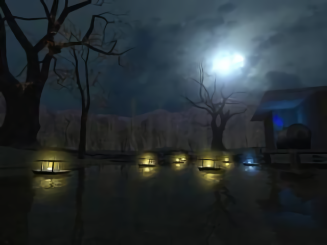
Lighting is ok, with some interesting area's like on the screenshots. I liked the funny little boatlights too.
The architecture lacks, though. Overall shapes are ok but they're rough and the difference between the brushes and the prop models is a bit too striking for my taste - they don't work well together yet. Put some more time in finetuning your brushes.
The same goes for the level in general: certain things are too rough. The train moved awfully slow and had some bad texturing. It also looked odd to see a single passenger train part moving... Then there's the edge of the level. Clipping off an area for no other reason than 'this is the edge' doesn't feel right. Add a natural barrier or such to make it believable.
Also, what's that big wall in the middle of the level? It looks strange...
All in all, the gameplay is ok but it needs some work on the finer points to make the map feel more solid and polished. Good luck with this!