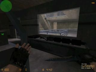
de_repo
- Name
- de_repo
- By
-
 psycosquirrel
 - Type
- Map
- Engine
- Goldsource
- Game
- Counter-Strike
- Category
- Completed
- Included
- BSP
- Created
- 19 years ago2005-12-22 00:27:20 UTC
- Updated
- 19 years ago2005-12-22 00:27:59 UTC
- Views
- 1391
- Downloads
- 485
- Comments
- 7
- Rating
- 2.20 (5)
- Reviews
- 0
This is a map I made recently for really no reason. I haven't posted for a while, but I figured I might as well upload one of my maps to see what people think... Back to the map...
It is an extremely small de map, where the terrorists must bomb the bottom floor of and underground complex (CTs spawn in the bombsite). I may make a 2nd version, which is larger and forces players to enter the main area of the map (as is now, players can stay in vents and stairwells and do fine... I don't really like that...), but for now I want some criticizm so I can know what else to change.
It is an extremely small de map, where the terrorists must bomb the bottom floor of and underground complex (CTs spawn in the bombsite). I may make a 2nd version, which is larger and forces players to enter the main area of the map (as is now, players can stay in vents and stairwells and do fine... I don't really like that...), but for now I want some criticizm so I can know what else to change.
7 Comments
You must log in to post a comment. You can login or register a new account.

 CS
CS


+ nice tunnel (maybe add a cool lighting effect for it to make it even better)
- the outside seemed very pointed and unrealistic (the cliffs)
- the stairwells seemed weird... maybe the stairs are too big or the textures didnt work with it... the rails were blocky
overall pretty good job... i hope to see ur 2nd version if u make it
**************
+/- Arhchitecture. It's blocky inside and you used prefabs a bit too much, although the cliffs outside looked quite ok. Good job.
The whole map had a very big cramped feeling. The stairs were way too small, the ducts could have been bigger too.
+/- Texturing. Twasn't bad, although some textures were badly aligned (lightswitches). And the textures were quite too repetative inside the building.
*************
- Ambience. some wind sounds, along with other ambience would have been good.
- Layout. It's quite simple, but the whole ducts are just WAY TOO COMPLEX! It's a damn labyrinth there! One could get lost way too easily.
- Gameplay. Theres only 1 bombsite, which is a big drawback, coz the CT's could just campthere all the time and kill the T's easily. The layout isn't perfect either, so that also makes the gameplay worse.
- Lighting. Dull. Just... dull.
***************
Well the map still needs work.. Lots of it. Perhaps make it bigger, expand it? Your choice.
3* in advance.
+/- Architecture, the outside looked alright.
+/- Lightning, I liked the dark style outside, inside lightning was just to fucking bright!!
- Ambience, I missed it.
- Layout, way too complex indeed, erm, to many vents!!
I really couldn't find my way around the damn map.
- Gameplay, Bomb Placements, wtf, at the fucking ct spawn?
I smell camping then since the vents are very easy to get lost in
- Texturing, badly aligned at some places and way to repeating in the whole map.
Honestly, this needs work, 2 stars!
As for the rest, well, it is apparent you have mapping skill, but you're not using it to it's full potential. The main layout is counfusing, cramped, and repetative, and would never make a good CS map imo.
This is actually a perfect layout for a DM map, If perhpas only making the ducks a tad bit bigger, so they are easier to traverse.
I desperately want to give this a 4 because of the tunnels uptop, but I'm afraid the bad of the rest of the map cancels them out to a 3, sorry!
1 very nice element + many bad elememts = 3 stars
- the stairs are incredibly messy,
- there are items to pick up,
- there is a water landing zone,
- the whole map got a general scale problem,
- HL textures.
+ the r_speeds are ok,
+ the map file is light,
+ this is not a dust remake, nor a "fun" map,
+ the map has something original, something that could make a nice map ...
Secondly, people on my server played this for about 20 minutes, and they were dying to play CT. It was an unfair map.
We never found the bombsites. CT Spawn? Only one?! Ct sided map.
Water was a decent glitch, but the very first time I jumped from the top floor, I was killed instantly upon impact with an oblivious CT's head.
Lights switches were nice, but ultimately ineffective.
Too many prefabs.
You couldn't walk down the tunnels, which wasn't believable. Use chain-link fence or maybe a blocking APC so I know why I can't go down them.
The stairs were too steep, and the entire map was just... it wasn't very good...
The outside was very nice, however.
I give it 2 stars