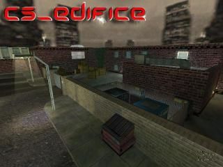
cs_edifice
- Name
- cs_edifice
- By
-
![][R()N](https://twhl.info/uploads/avatars/inline/2305.jpg) ][R()N
][R()N - Type
- Map
- Engine
- Goldsource
- Game
- Counter-Strike
- Category
- Completed
- Included
- BSP
- Created
- 18 years ago2006-02-25 07:00:15 UTC
- Updated
- 15 years ago2009-02-22 13:34:27 UTC
- Views
- 2032
- Downloads
- 1179
- Comments
- 5
- Rating
- 3.67 (3)
- Reviews
- 0
A 16 player hostage rescue map. The counter-terrorists must rescue 4 hostages by bringing them to the single rescue zone located at their spawn point. The terrorists must prevent the counter-terrorists from leading the hostages to the rescue zone. Custom textures have been used and are compiled in the BSP file. I'd appreciate constructive criticism regarding gameplay lighting, texturing, layout, etc.
EDIT: New download link.
EDIT: New download link.
5 Comments
You must log in to post a comment. You can login or register a new account.

 CS
CS


But what's up with all the doors only opening one way? I got stuck several times from that.
And what's the place supposed to be anyway? A house? It's got a public-ish bathroom (with urinals high enough to stick your head in), an office, a theater type place, a library, some advertisements on the walls, a fireplace, some industrial looking rooms with crates in them, and it's set in some inner-city ghetto. I can't say this really looks like anything I've ever seen.
You should change the skybox too. That one that comes with half-life is just ugly, in my opinion.
3 stars.
+Love the detail (Pictures, paintings, bookshelves, glass, plants, lights)
+Very nice architecture (outside, indoor lights etc)
+Custom Texures = Very nice!
+Nice Curves
+I like the little chimneys
+Indoors are excellent
+Loved how its side routes only to get inside. And how you gotta break in
+Sweet Layout
+Should have good gameplay
Cons:
-Railing texture inside doesnt look like it fits in...
-A room of crates!?!? (Got fed up making good rooms ay?)
-How can a car get onto that street and where would it go? (Add dispacements like a street that the player cant get to)
-Urinals very high up and big (Not very realistic)
-Coulda been completely custom textures...
All in all an excellent CS map, 4/5 Stars.
Interior detail is exquisitlely textured and looks great. Excellent props as well, but perhaps make some stuff more interactive:
Urinals: would be funny to be able to flush them and here the flushing sound lol
Home theatere: Make the tv togglable, or "snow" animated texture might be good
The individual glass blocks on the bathroom look great, and the light rays from the streetlights look nice too. The light rays by the doors at ground level though, you might consider making them more transparent or remove all together. Curved starway area also looks great!
-The door in the bathroom is set to open one way only, which reacts strangely when your walking out of the bathroom.
Library/projection room looks great too!
By comparison, the outside areas are a bit plain, but still very nice. Outdoors would be much improved if you added a custom sky!!!!!!!
-80,000 points for no ambient sounds. There are plenty of good places in this map to add them, inside and out, so...use them
Great work, but still needs some things imo.
4 stars