SmallHall Mappack

Counter-Strike: Source CSS
SmallHall Mappack by RaDianT
Posted 18 years ago2006-03-15 10:54:34 UTC • Unfinished • Counter-Strike: Source
Loading...
Screenshot Thumbnail
Name
SmallHall Mappack
By
RaDianT RaDianT
Type
Map
Engine
Source
Game
Counter-Strike: Source
Category
Unfinished
Included
BSP
Created
18 years ago2006-03-15 10:54:34 UTC
Updated
18 years ago2006-03-16 14:07:21 UTC
Views
1333
Downloads
469
Comments
8
Download

This is my small mappack. I made it some time ago but took it down. Now i have fixed some probs(no more fullbright, sorry) and other small things. Still i dont feel like the map is done, so if you have any suggestions, tell me please! fx. the maps are a bit boxy. How can i make them look more interesting? Please say something i can use instead of "HAHA LOL ROFL fucking n00b, fuck you, your maps SUXX!"
Ty Radiant

8 Comments

Commented 18 years ago2006-03-15 14:20:10 UTC Comment #11235
shiny blade.
Commented 18 years ago2006-03-15 14:22:18 UTC Comment #11236
saltycrak, please say why it looks like crap? And how can i make it better?
Commented 18 years ago2006-03-15 17:35:46 UTC Comment #11242
SaltyCrack, you absolute tool.
He jsut asked for some useful comments, what do you come out with? Crap.
I was just about to test it, but realised it is for CS.

But I can give you some pointers regardless of not having played.
*Work on creating inspiring and imaginative architecture.
*Texturing needs to be varied and try to fit a suitable theme.
*The layout needs to be developed on paper until you have worked out something that is fair for both sides, and working out where choke points are etc.

If you nail those 3 your map will be great. :]
Commented 18 years ago2006-03-16 06:39:47 UTC Comment #11260
thanks G_KID thats something i can use. I will try when i come home. im in school now :(
Commented 18 years ago2006-03-16 07:32:54 UTC Comment #11261
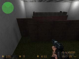
The screenshot (I can't play it here at school, too) shows only a dead-end corner that's badly lit. I'd say, take a screenshot that gives a better overview and shows a more interesting part of your map. Reminds me, there should be a book written about the Art of Screenshots. ;)

I'll check the maps once I'm at home.
Commented 18 years ago2006-03-16 11:13:42 UTC Comment #11266
k, thanks all. i will start working now, but i have to leave for rugby soon.
Commented 18 years ago2006-03-16 14:02:11 UTC Comment #11271
Saltycrap you nitwit don't give him bullshit...Although G-kid I hope you haven't forgot about the comment on my map ;)
Commented 18 years ago2006-03-16 19:28:51 UTC Comment #11277
Yep :].

Though you where teh noob Habboi :P

You must log in to post a comment. You can login or register a new account.