sol_arena
 HLDM
HLDM

sol_arena
by
Taylor
Posted 18 years ago2006-03-15 16:02:26 UTC •
Completed •
Half-Life: Deathmatch
Loading...

- Name
- sol_arena
- By
-
 Taylor
 - Type
- Map
- Engine
- Goldsource
- Game
- Half-Life: Deathmatch
- Category
- Completed
- Included
- BSP
- Created
- 18 years ago2006-03-15 16:02:26 UTC
- Updated
- 18 years ago2006-03-15 16:02:26 UTC
- Views
- 3682
- Downloads
- 988
- Comments
- 15
- Rating
- 4.50 (2)
- Reviews
- 0


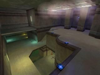
This is my compo entry...well, at least it recieved a special mentrion. Whatever, I didn't had much time for it, so it became a real small map with lots of weapon and ammo, with quite fast gameplay. It's a compressed version of the Unreal Tournament map "DM-Tempest". I've used the textures of the map, and in a few places the architecture too, but it also has a piece of my own ideas. Hope yall gonna like the lights, coz I put some work in it...guess thats all...so, please test it!
************************************************
By the way...wtf is this supposed to mean??(written by the HL console) couldnt exec config.cfg-I tried to reinstall the game, but it didn't help...winxp just thought one day, that it dosen't want to run the game properly, and it woludn't even let me configure the controls, so I can't even move:P...had to make the screenshot under win98...grrr
15 Comments
You must log in to post a comment. You can login or register a new account.
Screenie looks nice btw.
Beautifully constructed/textured/lit rooms, and quite imposing/scary imo. I can't stress that enought, the rooms looked really great! I think my fav was the one with the red lighting.
Layout is a bit comlex, but it works because it's so small. Kudos to you for how you interwove the floors together.
Use of different color lighting and sprites looked really good.
Now the complaints... The lifts were a bit of a distraction, as I kept fallin to my death! Maybe an up/down lift right next to each other might do the trick?
The three light rays or whatever kind of rays looked neat, but I think they might look better a bit more transparent. Still looked really cool though.
Weapons: Not enough of them imo, but not a huge deal.
All in all great work and a great contender.
Great work!
And yeah, it was extremly hard to judge.
Anyway, this map is pretty nice.
I'm not going to rate, because I do find this map a bit unfinished.
By the way, in the red room, I could jump out of the window.
Like Ant said, clip the windows!
I simply love the lightning, could you please tell me how you did those fuzzy funky lights? The ones seen in the screenshot on the ceiling.
Are those sprites or something??
This map needs a bit more weapons by the way.
Try cleaning up the trims and clipping the windows. Also might that the whole outside is being drawn. I think it was sky boxed or something. The first thing i did was fall out the window and was forced to restart.
Tweak these and you have a very nice and deserving 5 star map, by my rulebook.
/luffingolskoomaps
- Wadinclude please. It's easier to distribute that way and using the -wadinclude parameter only puts used textures from the specifiec .wad into the map, so it's probably smaller as well.
- Interesting look, feels Unreal. Nice use of colored lighting, too.
- Weapon placement feels a bit too uneven spread, item placement looks ok. Some weapons and items were put on stacks, I mean, very close to each other in niches, while the long hallways lacked weapons a bit.
- Nice use of vertical combat, but most of the map doesn't take advantage of it. There's 2 or 3 places where you used this and those were the area's I think will be most interesting to fight in.
- Feels like it's mostly corridors, combat is probably not very focussed. And with so many corridors, why isn't there a longjump? Corridors were too long and I think combat in those 'vertical' area's is much more interesting, so I would've cut down on the number and length of corridors and increased the amount of such combat area's.
- Lacks sound. Some sounds can get annoying quickly so this wasn't the worst map in terms of sound, but a little ambience would be a nice extra touch.
Nice impression, but probably just average in gameplay. Too bad, as it has a solid style.TECH STUFF (meant as advice):
- Compiled with old tools? -> switch to Zoners or more recent (sky wasn't auto-clipped?)
- Skyboxed. Absolutely no need for that, not skyboxing will save compile time.
- Small objects like light fixtures -> func_walls. Saves compile time. Also improves performance, though just a little bit.
Score: 7/10