aim_ak-deagle
 CS
CS
Loading...

- Name
- aim_ak-deagle
- By
-
 cristb
 - Type
- Map
- Engine
- Goldsource
- Game
- Counter-Strike
- Category
- Completed
- Included
- BSP, RMF/VMF
- Created
- 18 years ago2006-04-09 07:34:28 UTC
- Updated
- 18 years ago2006-04-09 07:34:28 UTC
- Views
- 1104
- Downloads
- 445
- Comments
- 6
- Reviews
- 0
This is my 1st map, took me 2 or 3 weeks to map it. Any comments are welcomefully. I don't expect any good, but I just want to get into my mapping career.
6 Comments
You must log in to post a comment. You can login or register a new account.
This deserves my download. I'll comment after playing
Here are several things you should look into for your next map.
1) Light sources... Your lights come from nowhere. Add an actual physical light brush instead of just an entity.
2) Texture alignment... I was impressed by your architecture (i couldn't do that in my first map) but it was ruined by very sloppy texture alignment. Shift + A brings up the Texture face tool, use it to align textures.
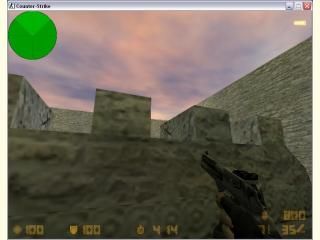
3) architecture... Like I already said, nice in some places, but honestly, the map was really boring... If you're going to use so few textures, make some interesting architecture. Things as simple as bumps in the walls will make a map a whole lot better.
4) Size... For an aim_map, this map is tiny... That will slaughter the gameplay and i doubt rounds would last longer than 30 seconds
5) More cover... Not crates though. Far too many maps are just filled with crates. they're boring and annoying. Try to find an original way of providing cover for the players.
Yeah, so overall, it shows promise. Keep at it
Texture Alignment: I already used it, but not at maximum
I'll keep on the good way, doing the good work.
That doesnt make sense
Perhaps vary the architecture above like Roman ruins, or something, and follow the directions Hunter gave.