No_Patience
 HLDM
HLDM

No_Patience
by
Orpheus
Posted 18 years ago2006-05-08 17:49:17 UTC •
Completed •
Half-Life: Deathmatch
Loading...

- Name
- No_Patience
- By
-
 Orpheus
 - Type
- Map
- Engine
- Goldsource
- Game
- Half-Life: Deathmatch
- Category
- Completed
- Included
- BSP
- Created
- 18 years ago2006-05-08 17:49:17 UTC
- Updated
- 18 years ago2006-05-09 16:11:59 UTC
- Views
- 1950
- Downloads
- 682
- Comments
- 16
- Rating
- 3.33 (3)
- Reviews
- 0


... My 8th release. (Released: November 2001)
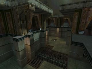
At the time of this maps creation, the idea of making a high detailed map and retaining the concept of low r_speeds was in danger of going in the trash. With the advent of bigger and more powerful computers, many new mappers, misunderstanding how badly they were wrong, began creating monstrosities.. Horribly created maps were swarming the nets.. In an effort to rekindle the ideals, I created this map to show new mappers that you can have great detail, without sacrificing r_speeds.. Most of the smarter people acknowledged the concept, sadly a few people continued to release crap.. I suppose, you cannot win them all.
(This map made LotW at Planet Half-Life)
16 Comments
You must log in to post a comment. You can login or register a new account.
I found a couple of things that sort of detracted from it though.
The textures you used were very nice, but but a lot of the time I didn't feel like they really complimented eachother very well. Their theme varied quite a bit, oftentimes making it feel kind of hodgepodge, with no defined theme.
Although this isn't too much of a problem, I noticed there wasn't actually very much detail in the map at all, like you said there was. Instead, it was mostly just high-res textures that were scaled down to give surfaces more detail. The only reason this worked, however, was because you used high-tech themed textures with lots of stuff crammed into them.
Other than these minor problems, there are a few other things that could easily be fixed.
I noticed when you're at the highest point of the map, with the skybox visible, you can jump up and see the paper thin edge were the skybox meets the top of the wall... just make the wall a little higher, or pull the skybox back a little so you can see the edge, and that will be fixed.
There was also a place were there were some grates in the floor, and they were just small enough so that you would sort of "trip" over the lip when you ran over them, slowing you down a little.
This is all just nitpicking though, it's a pretty good map. Assuming you aren't updating it, I'll give it a 3, but if you do, I might just rate it again.
+ good,
= meh,
- bad.
+ Awsome archetecture, simple and very effective.
+ Classicness.
+ Easy to navigate.
+ Weapon/items placement and supply.
+ Ambience, sound, an lighting were all avidly done.
= Null would polish this map off perfectly.
= Some textures from dod, but i don't mind, everyone takes something from something.
- The double ladders that go up put you nearly out of the map.
- Also, that top area need higher walls so player don't jump and see outside the map, exposing some of the lower areas of the map.
- Noticeably bad squashed textures. If you goning to scale, try keep them proportionate.
Overall, it has flaws that would easily be fixed. Put some shine on this map and hope it shows up on the TWHL server
Thanx for looking, I only posted these to show people that I can map and forestall any comments concerning my eligibility to comment here.
To those interested, this map made "Level of the Week" at PHL.. Its worthy of notice.
Why do you even put these here if they don't show your actuall skill?
Do you have something to proof? If you want to get some respect here for your mapping abilities, help the people in the HL discussion section or something. That will show you know your way around Hammer more than releasing maps that you made a few years ago..
(I didn't played the map, I just felt to say this. Don't take it as a offence.)
I remember seeing this map on SP and I felt it looked good...Actually surprised you mapped Orpheus.
FresheD: First it is 'prove'* and Orpheus doesn't have anything to prove..He just wants to share his map.
Anyway I think it's about bloody time some good maps came up on the front page..They caught my eye.
Lighting in this map is better, and the textures give it a nice rusty theme. The firetraps are quite good and offer a fun element that we don't see in most maps out there.
This map made me think about somes maps by Scary One I saw years ago in PHL. It also feels like some of the maps by rend0us, another member of twhl Others have already commented on the strange stretched texturing, which was very noticeable in some places.
I really like the texture choice too. Very innovative. Reminds me of a map from Turok: Rage Wars from Nintendo 64
Besides, I know Cappy, he doesn't copy hallways.
As for the rest of your reply, I'll file it away under "Stupid peoples posts"
As if I create all my hallways like that, and as if I've created that many maps...
zeeba-G, Orphs maps have been made years ago. Of course they're HL-ish, in fact, your map is more HL-ish than this particular map. That isn't a bad thing per se. Fire traps and lava ramps are unoriginal? Of course. Everything has been done before in some way or another. That's not the point here, the point is whether they 'work' or not. A fire trap, how cliche it might be, can still provide good fun during play.
Actually, I think this map is ok. It seems to be built with gameplay in mind and it looks like it handles that well. The graphics are fine but feel a bit disjointed.
Or rather, calm down and ignore such comments, or ask for clarification. Mad comments usually don't do yourself well (for example, your comment about my hallway(s) felt odd, dumb almost, and now it turns out it wasn't based on much at all).
As for clarification, after I asked for it it turned out Orph sees 4 stars as almost-perfect, and that's a stage your map hasn't achieved quite yet. It has good points, but also lacking points.