cs_the_underground
 CS
CS

cs_the_underground
by
DacadeXI
Posted 18 years ago2006-05-25 03:00:16 UTC •
Completed •
Counter-Strike
Loading...


This is my first map, so It's not going to be all that great. Don't be easy on me just because this is my first, if you think it's crap then tell me about it. I finally finished it, but it's still looking unfinished, that's because I took everyone's advice, and started a new map with that advice, so I kinda just hurried up and finished it. Again, first map, so it's not anything special.
7 Comments
You must log in to post a comment. You can login or register a new account.
It looks like you browsed for a model...
fixed
Makes a lot more sense now; I thought it seemed like an empty mock-up of a layout.
Well, I'll post the comments I jotted down anyway.
- Many rooms very very plain, corridors too.
- Point lighting.
+ Generally kept textures in proportion (a common source of newbie errors).
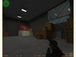
- Crates. Really, use something different.
- Scale: some corridors seemed alarmingly large, then others excruciatingly narrow. It makes no sense.
+ Good layout.
+ Parts of the map were clearly recognisable, aiding quick learning of the map (probably the easiest-to-learn CS map I've ever played).
- Textures on a few sides of dividers, walls, stuff like that, had clearly been scaled "to fit". Can result in compiling errors in many cases, and looks nasty.
- Inexplicable cover: why were there weird little walls in corners sometimes with windows in? Again, makes very little sense.
- Some very thin walls where you can see the sides.
So overall, good for an unfinished first map. The hostage room brought back memories of my first CS map, heh heh.
1 - Don't overuse crates, they look redundant. In fact, if you can help it, don't use any.
2 - Even if you don't have the inspiration or skills to make awesome architecture, making anything but a box room will go a log way towards making the map feel better.
3 - Don't put 4 hostages into a room the size of a closet.
4 - Make sure your light is coming from somewhere. Having hallways that are lit up by little bright spots doesn't look too good at all.
5 - Tone down the lighting a bit. Some places looked like they were nearly fullbright.
6 - Use more textures. If you aren't sure about what to use while building the foundation, you could go back after you're done with all your main brushwork and put in more variety.
That's all I could think of at the moment. I would like to say, though, that it isn't all bad. Rooms like that one that had a walkway and support pillers really stand out from all the rest. you usually just need to go through afterwards and try adding details like that to the rooms, and it'll look more interesting.
I also noticed you used quite a few ramps and stairs. This can add diversity and a vertical aspect to a map, if used correctly.
This certainly isn't the worst first map I've ever seen, and it's a lot better than mine was. keep at it, and you could be making fairly good maps in no time.
You can use crates but don't over use them. A few crates in a storage room or in a warehouse are a very nice addition but not if they are alone. Add other kinds of detail too.
Try to give any kind of light a source, sourceless lights look weird.
Avoid using long and repititive surfeces. Try using more textures and add some trims to walls.
I can't give any other suggestions for I didn't play the map. I don't have CS.
My biggest pet peeves with this map are the gigantic/confusing layout, bland as hell texturing, and the utter lack of detail.
That said, I like the "feeling" this map gives me. I kept desperately trying to find a way out to see the sky, unsuccessfully. Even thouhg the ceilings and size of the rooms were pretty big, I still felt trapped, which is good for an undergound theme maybe.
Architecture is not the most interesting, but it's clean, and some potentially interesting stuff like the window that curves with the stairway--neat idea, even if it didn't turn out so well imo.
All and all, superb work for a first map!
Nice job