HL1 Engine Is Not Old
 HLDM
HLDM

HL1 Engine Is Not Old
by
gordonfreeman
Posted 18 years ago2006-05-28 05:43:44 UTC •
Completed •
Half-Life: Deathmatch
Loading...

- Name
- HL1 Engine Is Not Old
- By
-
 gordonfreeman
 - Type
- Map
- Engine
- Goldsource
- Game
- Half-Life: Deathmatch
- Category
- Completed
- Included
- BSP
- Created
- 18 years ago2006-05-28 05:43:44 UTC
- Updated
- 18 years ago2006-05-28 05:43:56 UTC
- Views
- 2194
- Downloads
- 752
- Comments
- 3
- Rating
- 4.00 (1)
- Reviews
- 0


hope it's okay now. Last time I tried to wadinclude textures. hell. please ignore this accident.
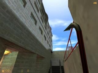
gf_hl1_engine_is_not_old. DM for 2-5 players. But not for big crowd for sure.
finally I finished the map you seen recently at the unfinished section. made a few improvements outside, added an interior part. I tried to spend more time on things you guys didn't like before, for example, this map now has ambience... anyway, I think I improved a bit since my last maps, but I'll let you decide that. The hard thing this time was to keep a balance on the map: weapons/healths etc placing at the right place, I am not sure if theyre a hundred percent okay. Please download, rate and comment, thx.
gordonfreeman
3 Comments
You must log in to post a comment. You can login or register a new account.
Beautiful destructification! You should have entered compo 20
Nice sounds and clean brushwork.
The biggest problem I have with this map is how tiny/tight it is. The corridors inside of the building are impossibly small for a dm match, and you can run around the entire thing in under 30 seconds.
Weapon placement isn't the greatest or most interesting either. Usually you have the "weak" weapons are easily findable, while good ones like the Egon gun are hidden.
Play some good dm maps, and highlight in your mind what you like and don't like about them, and apply to your map
**bocsesz, hogy nem magyarul irtam, csak igy legalabb a tobbiek is el tudjak olvasni:P **