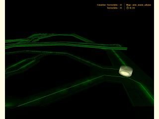
aim_neon_abyss
 CS
CS
aim_neon_abyss
by
Soup Miner
Posted 18 years ago2006-06-23 23:03:32 UTC •
Completed •
Counter-Strike
- Name
- aim_neon_abyss
- By
-
 Soup Miner
 - Type
- Map
- Engine
- Goldsource
- Game
- Counter-Strike
- Category
- Completed
- Created
- 18 years ago2006-06-23 23:03:32 UTC
- Updated
- 18 years ago2006-06-24 11:53:59 UTC
- Views
- 2700
- Downloads
- 935
- Comments
- 2
- Rating
- 4.00 (1)
- Reviews
- 0
When I first started mapping I swore to myself that i would never lower myself to the level of making an aim_ map. Well, I guess I broke my promise. I was bored and I wanted to take a break from a bigger project that I am working on so I threw this little number together in a few hours. Weapons available are mac10, tmp, and mp5(in the middle). as it is with all my small maps, there is a way to fall off the edge and die so be weary of the edges.
I'll probably end up deleting this map considering the length of time it took to make and the overall simplicity(and the fact that it is an aim_ map) but if you guys want me to keep it up I will.
June 24: Fixed lighting error that cause the sky to emit the same light as the map that was played before.
2 Comments
You must log in to post a comment. You can login or register a new account.


The background noise could get a little irritating though, so you might want to replace it with a less repetitive one, if you plan on working on this any more.
I didn't think I'd give a rating to such a simple little map, but turns out this one is actually pretty good. There's nothing great about it, but there's nothing bad either!
The shadows from the green neon thingies will look more uniform if you scale down that floor texture a bit--at least I think so, and that's inferring you WANT it to look more uniform
Nice, smooth-lookin, two-sided volumetric light as well.