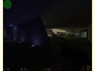
aim_alien27
- Name
- aim_alien27
- By
-
 swiftd27
 - Type
- Map
- Engine
- Goldsource
- Game
- Counter-Strike
- Category
- Completed
- Included
- BSP
- Created
- 18 years ago2006-07-06 17:41:00 UTC
- Updated
- 17 years ago2007-07-25 18:29:49 UTC
- Views
- 1635
- Downloads
- 524
- Comments
- 8
- Reviews
- 0
Yes, another aim map, but i think i've really out-done myself on this one. This time every1 starts off with a m4a1 in a very halo-like type of map (atleast thats what i thought). Its much more complex than the average aim map, along with a couple bomb targets;and to top it off, I tried my best to put good contrast in the lighting (for rowleybob's sake  ). constuctive criticism would be great....
 ). constuctive criticism would be great....
8 Comments
You must log in to post a comment. You can login or register a new account.

 CS
CS


im confused. Enlighten me
Anyway, I'll finally download it.
Rather then paying a couple hundred dollers for photoshop, you can dowload IrfanVeiw for free, and I'm pretty sure it hase some basic tools for touching up photos (brightness, contrast ect.) Just so you know.
Lighting is much improved...KUDOS!
I like this version much better, in fact, I didn't even recognize it from the last one until you mentioned the lighting thingie.
+Nice Architecture
+Various types of bunkers with the small slits
-ambients?
+Very neat layout
Again, this map looks like it would be lots of fun to play
I was gonna update the map to fix a phew mistakes in the map,as well as make i look better, and i thought i might as well throw in some ambients and it added a lot of environment to the map.
also i changed the name of the map.