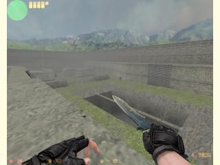
aim_para_27
- Name
- aim_para_27
- By
-
 swiftd27
 - Type
- Map
- Engine
- Goldsource
- Game
- Counter-Strike
- Category
- Completed
- Included
- BSP
- Created
- 18 years ago2006-10-01 20:22:48 UTC
- Updated
- 18 years ago2006-10-03 15:53:35 UTC
- Views
- 1748
- Downloads
- 542
- Comments
- 8
- Reviews
- 0
This is a map i just made fairly quickly. Simple map based in a aztec layout. Everyone starts out with m249 para,glock , and a nade. There is a buyzone on the middle bridge, however, as well as some guns lying around.
Overall, i feel pretty happy with this map (for an aim map). I think it would be a lot of fun with a lot of people playing. Constructive criticism would be appreciated (unless your just gonna tell me how my textures suck).
Overall, i feel pretty happy with this map (for an aim map). I think it would be a lot of fun with a lot of people playing. Constructive criticism would be appreciated (unless your just gonna tell me how my textures suck).
8 Comments
You must log in to post a comment. You can login or register a new account.

 CS
CS


Sorry for my negative comment, but seriously, if your gonna make an aim map, make it look absolutely awesome, and i mean absolutely awesome.
But you basically just explained the whole idea to yourself, popular aim maps that are fun have been made (eg aim_map), this will (i assume) never be popular. Also if you try and make it look good, the rspeeds go up, and thats not the point of aim maps now is it? They are for fun. Just do your self a favor and stop making aim maps today. We want to see some effort, not some crappy aim map you slapped together as fast as you could. To me aim maps are even worse than dust remakes, they have less skill and are all quite the same. I guess i cannot really think of any constructive criticism because its just an aim map. So like i said, put some real effort into a map. Most people here wont even bother downloading this map because there have been so many aim maps. I hope you dont feel shutdown or anything, im just trying to explain to you that this community is looking for impressive maps, that are also fun. https://twhl.info/vault/view/4066 read that if you are really passionate about making aim maps, it will show you a real theme, and not an orignal map aztec theme, which is only changes the textures and not solids (that much at least) I hope that since i cannot criticise your map so that you can benefit, i can criticise your map to help you in the overall game.
A lot of the nicely stylized trims/walkways you have you can't fully appreciate, unless you noclip and go way up to look at them... maybe scaling the hole map down would help with this. Add more fine detail work/different textures to make it more intersting too.
The nice trench of death in the center vaguely reminded me of an old roman cistern, sans all the decorative support structures.
And to everyones releif (especially mcmitcho's), I officially announce an end to making any more aim maps. Infact, rowleybob already gave me an idea for my next map (but unfortanately it would require custom textures which i HATE; Wally's even more confusing than hammer in my oppinion). Anyways, the next map I make i'll put a little effort into or just quit altogether (seeing as how theres already about 10000 custom maps out already, who cares for the 10001'th (but thats just my oppinion) )