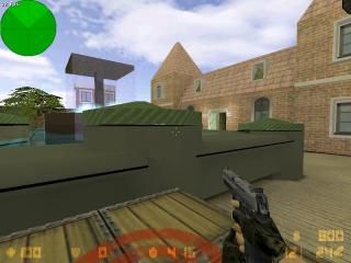
de_disneyland
 CS
CS
de_disneyland
by
crazylf2
Posted 18 years ago2006-10-06 23:11:36 UTC •
Completed •
Counter-Strike
- Name
- de_disneyland
- By
-
 crazylf2
 - Type
- Map
- Engine
- Goldsource
- Game
- Counter-Strike
- Category
- Completed
- Included
- BSP
- Created
- 18 years ago2006-10-06 23:11:36 UTC
- Updated
- 18 years ago2006-10-07 09:39:00 UTC
- Views
- 3439
- Downloads
- 804
- Comments
- 3
- Rating
- 3.00 (1)
- Reviews
- 0
this is a part disneyland map , at the Main street USA
many custom textures were used to make this map
(added .Res file)
many custom textures were used to make this map
(added .Res file)
3 Comments
You must log in to post a comment. You can login or register a new account.


http://img413.imageshack.us/img413/747/exosssssssspegda9.jpg
Also I can clip through some props. Put some player clips around them so you can't walk through them. Also THe side walks were to far elevated. If you are going to do that, put player clips infront of them in kinda a slant form, so it is like walking up a ramp. It is annoying to have to jump onto the sidewalk.
I think there is more but I don't feel like loading the map up again. All in all three stars. (2.4.... but because of custom content like 2.7 rounded to 3. Because you most likely didn't model those trees, and if you did, then your awesome!)
Some neat textures, architecture, props, and some cool entity effects. It's been a long time since I've been to Disneyland, so I also don't have a point of reference to judge how things look, but you can tell this is somewhere you've been by the 'comprehensiveness' of the map, which is always cool.
Those upstairs windows, in the the building with the movie projector look really nice, and the fx from the projector gives a neat glare from the outside looking in.
The building with the dormers--roof windows--is also really cool inside and out, but you could probably eliminate those pesky brush errors by using HLFix, which comes with the latest ZHLT afaik.
Having the Magic Kingdom Castle cut in half is a bit of a big distraction, and something you might address in a future version. Maybe you could somehow blend in the existing 'facade' with a custom sky, so you can see the whole castle. You other options would be to use models for parts of the castle, or of course, try brushing it.
Scale everywhere is waaay too big and that's another big issue with this map. There are multiple other small errors and "glithes" here too, so hopefully as you become a better mapper, you'll come back and fix this up or redo it
All in all, still very neat work