de_bedroom

Counter-Strike: Source CSS
de_bedroom by davideo59
Posted 18 years ago2006-10-07 15:05:51 UTC • Completed • Counter-Strike: Source
Loading...
Screenshot Thumbnail
Name
de_bedroom
By
davideo59 davideo59
Type
Map
Engine
Source
Game
Counter-Strike: Source
Category
Completed
Included
BSP
Created
18 years ago2006-10-07 15:05:51 UTC
Updated
18 years ago2006-10-07 15:05:51 UTC
Views
2559
Downloads
845
Comments
8
Rating
3.50 (2)
Reviews
0
full star full star full star half star empty star Download (6.28mb)

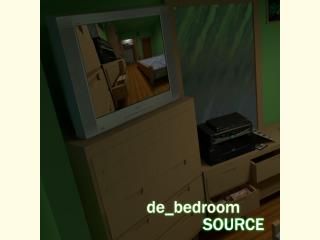
A de_rats style map of my room! A long time ago I made de_bedroom for 1.6 and sadly the file came corrupt and I couldn't work on it anymore. When source came around I picked up where I left off and remade the map from scratch in "source-quality." If you read the text file that came with it you can get more information about it/bombsites and such.
(Sorry for the bad download link at filefront, if anyone can host it for me I'd be grateful)
For those who don't have source... despite the quality and realism being bad the original de_bedroom is fun to play still imo. It can be found in the vault.

8 Comments

Commented 18 years ago2006-10-07 15:51:13 UTC Comment #13109
Pros:
Fun map to walk around in.
TONS of custom textures.
Cons:
FPS is bad in some spots. (27!?)
It looks like Half-Life 1 mapping. Nothing in this map makes it looks like Half-Life 2 except for maybe the displacement of the bed. Whitch raises the question how you get 27 FPS in this simplistic map.
The spots where you can blow holes in the wall are protruding out of the wall for some reason.
On the desk, where the drawer is, it is intersecting the brush of the desk. And you can see it.
Hard to figure out what you can climb.
Some textures had no detail at all.
Was there HDR in this map? If no there is no need for it.
I think there is more but all in all three stars.
Commented 18 years ago2006-10-07 17:48:16 UTC Comment #13110
Their protruding out of the wall to let the player know that theirs something wrong (despite the decals).

*I don't know how I missed that texture mess up on the desk drawer I know for a fact that it wasn't like that in earlier versions ><
(I'll be fixing and reuploading tonight)

I don't particularly understand what you mean by some textures had no detail, can you explain that more please?
Thanks for the comments too :)
Commented 18 years ago2006-10-08 07:33:38 UTC Comment #13118
Well some textures were good, but the wall texture was just plain, you could of normal mapped it to add a little bit if detail. :P
Commented 18 years ago2006-10-08 16:34:35 UTC Comment #13126
great map, but you could have made some things prop_physics or better yet prop_physics_multiplayer, thiis would give the enviroment a more lifelike feel instead of just brushes, but besides that i absolutly love it!
Commented 18 years ago2006-10-09 10:54:56 UTC Comment #13130
Prop_physics_multiplayer are basically useless in CSS. They are only for fixing problems with collisions with other players. Basically only for Half-Life 2 Death match because you can throw physics objects at players. In CSS they are just annoying, because you bounce off them.
Commented 18 years ago2006-10-09 12:53:55 UTC Comment #13131
Also I don't think he could add any props considering they would have to be HUGE to match the maps theme. There is basically no props he can use to make it match.
Commented 18 years ago2006-10-09 12:55:32 UTC Comment #13132
Originally I had ideas for a few props that I would make myself.. But honestly I have so much trouble with modeling lol, nothing turns out right
Commented 18 years ago2006-10-09 13:02:07 UTC Comment #13135
Oh, and what I meant by "source-quality" is just that its more detailed and realistic compared to the old version. Look in the vault for the 1.6 version and you'll notice an ever so slight difference ;P

You must log in to post a comment. You can login or register a new account.