Dmc_GrayDust
 DMC
DMC
Dmc_GrayDust
by
P3R16O50
Posted 18 years ago2006-10-09 21:33:51 UTC •
Completed •
Deathmatch Classic
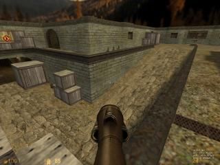
This is a partial remake of classic De_dust of CS. This map is for DeathMatch Classic MOD (DMC).
And, that's include some nice secrets!
Enjoy
And, that's include some nice secrets!
Enjoy
10 Comments
You must log in to post a comment. You can login or register a new account.


I don't have DMC installed, so I can't test this, and I can't say I really want to either (I'm not much into that crazy fast-paced style of game).
Still, the screenie looks okay, so I'll give it a rating.
I'm not downloading this either (sorry).
Ok, I said to him that the dust thing would not be the best, but he did a great job in making the architecture well and placing those good textures.
The lighting is OK and the gameplay is a little different from the most DMC maps. Those open areas from Dust are great for it.
And Dust were a remake (The CT area) From an old screenshot from TF2
What makes this map so worthwhile is the changes done to the original layout to help flow for DMC. Interestingly enough there is a change (the stairway connecting underneath the bridge) that I believe is inspired by an actual alternative path that was cut from the original de_dust, but my memory could be faulty here.
Another notable difference is addition of secrets which are pretty core to Quake/DMC and give this map character of its own. Finally when it comes to visuals, it nails the aesthetic of DMC and just looks really nice in general. Lots of great little details and additions throughout, my only complaint is that you can see a giant ad for a now defunct website, should've left that exclusively to the secret room, but oh well.
An easy 5 for me, worth giving a second chance even if you hated dust or the seemingly endless ocean of remakes it had. This could've just been another run of the mill boring port, but P3R16O50 wanted to make this feel like it was made by Valve themselves for DMC, and he achieved that goal.
One last thing worth nothing is that Valve ships a version of dust1 for CS:GO that has layout modifications similar to this. Not saying they were inspired by this map specifically, but even Valve had similar feelings about the layout.