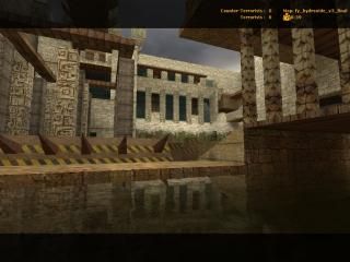
fy_hydroxide_v3_final

Counter-Strike: Source CSS
fy_hydroxide_v3_final by THE_SHRUB
Posted 17 years ago2007-02-09 21:15:26 UTC • Completed • Counter-Strike: Source
Loading...
Screenshot Thumbnail
Name
fy_hydroxide_v3_final
By
THE_SHRUB THE_SHRUB
Type
Map
Engine
Source
Game
Counter-Strike: Source
Category
Completed
Included
BSP
Created
17 years ago2007-02-09 21:15:26 UTC
Updated
17 years ago2007-02-09 21:15:26 UTC
Views
1492
Downloads
514
Comments
6
Rating
4.00 (1)
Reviews
0
full star full star full star full star empty star Download

Link to the extended version

ok, this is the final version of the map i posted yesterday, Note that i have re-done the textures and I personally think it looks alot better!! thanks for the advice guys!

THE_SHRUB

6 Comments

Commented 17 years ago2007-02-10 10:16:29 UTC Comment #14188
aha! so much better with textures!
Commented 17 years ago2007-02-10 14:09:29 UTC Comment #14189
I KNOW!!!! I was in shock when i finally played it with proper textures!
Commented 17 years ago2007-02-10 15:40:35 UTC Comment #14190
I actually want to download this now!
Commented 17 years ago2007-02-11 21:14:15 UTC Comment #14201
There, y'see? Now people love you :P

Texturing is an important part of mapping. Never leave it out :)
I'm glad you listened and textured it.
Commented 17 years ago2007-02-11 22:34:16 UTC Comment #14202
lol thanks for all the compliments, and the advice. I'll b sure to never leave out the textures again! but does anyone have some feedback on gameplay??
Commented 17 years ago2007-02-14 20:42:03 UTC Comment #14225
An above average FY map. Pretty open design with blocky architecture. You can hold your position or rush on several levels above and below ground. With so much height being used, you really need to work together (safety in heavily armed numbers lol) to win. The water is also used to allow people to jump down during a mad rush. It's then confusing why you made the underground a camper's paradise. A light comes of of nowhere down there and I can see people just sitting there the whole round in a shadow. Beside that, I have two other suggestions. First, make those spikes causes damage and not for show so rushers play a little russian roulette when they run right into that sloped barrier. Second, for some visual flair, you might want to make the map seem to have less of a boxy shape and make bridges leading to nowhere look less like cubes, and more like thing that have snapped off/ collapsed.

You must log in to post a comment. You can login or register a new account.