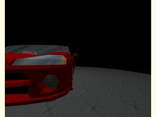
Dodge Viper
- Name
- Dodge Viper
- By
-
 Soup Miner
 - Type
- Map
- Engine
- Goldsource
- Game
- Half-Life
- Category
- Completed
- Included
- BSP, RMF/VMF
- Created
- 17 years ago2007-02-15 00:10:39 UTC
- Updated
- 17 years ago2007-02-15 00:15:18 UTC
- Views
- 6759
- Downloads
- 1352
- Comments
- 12
- Rating
- 5.00 (9)
- Reviews
- 0
My entry for Mini Compo #10
812 solids. Take you're time looking at this one, there's a lot of small details.
Sorry, there's no interactivity with this one. I focused soley on what the compo was for, advanced brushwork.
Note: Some extremely tiny faces were discarded when the map compiled, it doesn't affect the general look of the car, but if you are looking carefully you'll definitely see them.
Also, I know it's too wide, but I only noticed after it was too late. At most angles it's obscene width isn't too noticeable, though(only if you are looking at it from a bird's eye view). Whatever, it still looks amazing

12 Comments
You must log in to post a comment. You can login or register a new account.

 HL
HL


++On the whole, the most detailed contours of any entry yet. My favourites were the various intake/exhaust vents, the grill, THE RIMS! and the beautifully contoured windshield
++Nice custom textures and interior detailing--suprisingly similar to Tetsu0's, but probably done a wee-bit cleaner than his. The color you chose for the paint is definitely nice and sharp.
-sounds
-interactivity
-scale
Your entry lacked interactivity and use of any sounds, which isn't the main focus of the compo, but it would have been nice of course!
The scale is wide and a a bit flattened--as you warned us--, but surprisingly, it doesn't detract from the overall impression from most angles. A couple simple things you could do to artifically mask this a bit, without majorly redisigning the whole thing:
? The wheels look spectularly good, but they are WAY too narrow--see pizza cutters!. I'd widen at least 2-3 times theire current width, or more.
? Like Kasperg did--except the opposite--, you might raise the car up on an invisible--or visible even--platform to artifically make it look taller.
There's probably some other simple tricks you could do to spoof the scale a bit, but I can't think of any atm. Even rescaling in the time you have left may not be as hard as you might think--you have nothing to lose as long as the original entry is backed up.
Anyway, Another spectacular entry. I'm SO glad you stuck it out and sumitted an entry for this one... Welcome Back!
*****
Besides the scale, the only thing I miss is the white stripes these cars usually have on the outside. I think they would make the curved surfaces more visible (some polygons are kind of visually lost because of the uniform texturing)
Two thumbs up!
This is great!!
I love the hood, the side vents, the back of the car is superb as well.
The scale is off, but i really wish it wasn't. It's such a good looking car.
GREAT work.
5*
Nice work.
Though it still deserves 5*, just for the effort. :>