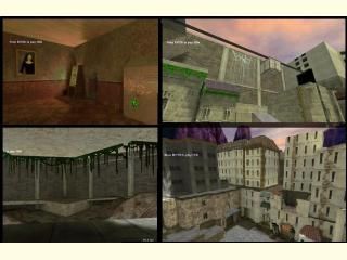
xdm_sharppains
 HLDM
HLDM
xdm_sharppains
by
rend0us
Posted 17 years ago2007-03-02 07:28:52 UTC •
Completed •
Half-Life: Deathmatch
- Name
- xdm_sharppains
- By
-
 rend0us
 - Type
- Map
- Engine
- Goldsource
- Game
- Half-Life: Deathmatch
- Category
- Completed
- Included
- BSP
- Created
- 17 years ago2007-03-02 07:28:52 UTC
- Updated
- 17 years ago2007-03-02 07:32:45 UTC
- Views
- 1830
- Downloads
- 751
- Comments
- 5
- Rating
- 4.00 (1)
- Reviews
- 0
hl death match map thats not small in size. tried to pay close attention to the structure to keep smooth gameplay. hope it is enjoyed. please comment and rate. thanks all..
5 Comments
You must log in to post a comment. You can login or register a new account.


I like the fact that you included lots of buildings this time, and it sure makes the whole thing look more real. The terrain looks great once again.
Some textures don't tile properly in the buildings (I think they are meant to be only at floor level and not extended through all the facade), and as in your previous maps, I still feel there are too many textures. Lighting color doesn't unify the whole theme as it did in xdm_capsule2, so some of them look out of place. I can't really tell which ones, it's a overall effect I feel.
Anyway, this is certainly moving in the right direction. Try lots different light enviroment colors before releasing your next map and see if helps in any way.
the back yard bumpy half of the map back side of the map was made in terrein generator. but it was designed for tau jumping as well..
tks fellas
https://en.ds-servers.com/maps/goldsrc/valve/xdm_sharppains.html