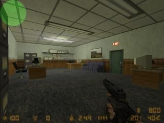
de_mainframe2_cz
 CZ
CZ
de_mainframe2_cz
by
Cat Like Thief
Posted 17 years ago2007-04-03 18:42:53 UTC •
Completed •
CS: Condition Zero
- Name
- de_mainframe2_cz
- By
-
 Cat Like Thief
 - Type
- Map
- Engine
- Goldsource
- Game
- CS: Condition Zero
- Category
- Completed
- Included
- BSP
- Created
- 17 years ago2007-04-03 18:42:53 UTC
- Updated
- 17 years ago2007-04-04 12:46:06 UTC
- Views
- 1202
- Downloads
- 410
- Comments
- 8
- Rating
- 2.00 (1)
- Reviews
- 0
My new cz map, all comments welcome! Enjoy!
Allows bots
Allows bots
8 Comments
You must log in to post a comment. You can login or register a new account.


This is just a dumb example of crappy typing. Watch your typing!
We all do it sometimes.
And some people does it more than others etc etc.
Downloading the map..
I was matter of fact impressed by this map on the same time as there were many things wich I didn't like.
-The size off the doors was iregular, some doors were huge, some were too small. Try to make one door wich has perfect size, copy it and use it everywere (of course not with the same texture)
-U used some prefabs - make ur own instead.
-The map was pretty empty
-World algined decals (bomb zone B had a reversed B, tutorial on how to fix it here: http://www.twhl.co.za/tutorial.php?id=45 )
-You used lightentities, use texture lights or "texlights". (tutorial on how to use texlights here: http://www.twhl.co.za/tutorial.php?id=54 )
-The ceiling was very low in some areas.
-Texturing was pretty bad.
-Boxyness
Tho there was quite many bad things I was still impressed by the structure of the map wich was great.
You managed to create a quite large map even with height differences and still the map was keeping it together.
A large + for that.
+Map structure
+Outside area (I liked it, but still it was a bit empty)
2 stars all in all.
Keep up the good work.
PS
When creating CZ or CS:S maps, remember to include in your description if the map supports bots or not.
Put in some detail, more arch and fill up the emptyness, it will rock.
The firefights was great (I played against bots)
The bots behaved OK, but they often got stuck behind the metal-bars in the underground waternetwork.
I'm not very familliar with bot nav but there should be a way to make them go around the bars.
Ask The hunter, he is good with bots - Source bots and CZ bots are as far as I know pretty much the same.
never.