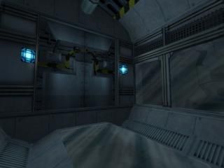
Gearbox Hallway
My late compo entry.
Basically - a hallway, located in some sort of engine.
I went over the top with this one, paying lots of attention to detail. The result: 4700 wpolies in the ends of the hallway.
Hope ya like this.
Basically - a hallway, located in some sort of engine.
I went over the top with this one, paying lots of attention to detail. The result: 4700 wpolies in the ends of the hallway.
Hope ya like this.

6 Comments
You must log in to post a comment. You can login or register a new account.

 HL
HL


I love the ambiance, the shakes are well placed, not overdone.
The only thing i say is the windows aren't transparent enough but Very good job. I like.
This is good! I just love the shakes, booming and industrial sounds.
WIN!
[borat]Vary nice![/borat]
+Superb detailing
Complicated trims, wall panels, flooring, everything is detailed nicely. I will say as much as i like detailing myself, it's a waste sometimes with the HL engine, as many times you can't appreciate the detailing unless you go in hammer and look at all the seperate brushes. (the doors for example are detail-brushed exquisitely, but because you can only look at them head-on, you can't see the details unless you walk right up to it. In these cases sometimes you can use stark texture changes for beveled areas/trims, and subtle lighting/shadow to make that nice detail stand out!
+Great Effects/sound
Your maps always have nice sound and other realistic effects... bravo!
-Lighting
You could use little textlights on the floor/ceiling incrementally down the hallway to give some nice shadows. I would also eliminate all the point lighting, xcept if you have some persisting weird shadows on your func_rotating gears, where in that case actually i'd make the texture of the gear itself a textlight at brightness of 1 to rid any harsh shadowing.
--glass
those beautiful gears in the walls but you can't see them through the glass because it's too opaque! Careful if you have your brigtness/gamma/contrast settings tweaked, you might be getting a different picture than we see! = )
To Conclude, I thought it was an awesome and inspiring map, despite some few issues. 5 stars for wicked attention to detail and hard work easily.
= )