aim_snipe-it
 CS
CS
Loading...

- Name
- aim_snipe-it
- By
-
 luke42
 - Type
- Map
- Engine
- Goldsource
- Game
- Counter-Strike
- Category
- Completed
- Included
- BSP
- Created
- 17 years ago2007-07-10 22:35:42 UTC
- Updated
- 17 years ago2007-07-10 22:45:23 UTC
- Views
- 1302
- Downloads
- 443
- Comments
- 11
- Rating
- 2.00 (2)
- Reviews
- 0


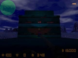
MY VERY FIRST MAP. this is my very first map. it is a small aim map including
-scouts
-AWPs
-smoke grenades
i have also included lights that can b turned out by shooting the small squares on the second level.
i also intended this map to be dark to make it harder for the snipers to see.
i know this map is not perfect so please leave feedback (remembering this is my first map) thanks , luke
11 Comments
You must log in to post a comment. You can login or register a new account.
After all, aren't most actual FIRST maps the cube from the in the beginning tutorials, filled with stupidly numerous monsters? i know mine was =]
Anyways, regarading the map itself - you're showing some clear potential.
Give him some feedback or something and don't be an asshole.
That's not what matters though. If this is really your first map beyond the simple cube, then you're doing a really really good job. You're definitely getting those entities down, which is obvious from seeing that func_rotating fan, the door with the button, the colored lighting, and the use of the transparent "{" grate texture. Most people get by without using these things for quite a while after they've started mapping. I know I did.
Anyway, you need constructive criticism if you're ever going to improve, not just compliments.
Something you really need to work on is your architecture. Now, I won't stress this too much, since you are a beginner, but this is an area you really need to improve in. You seem competent enough in the basics of it, but you really need to focus on designing something more realistic. This tower thing here, it doesn't have a real-life counterpart, and you can't really tell what it's supposed to be, or what its purpose is. I suppose that's fine for a test map, but if you're looking to move on to better things you'll have to start approaching this in a different manner.
Now, along with architecture, you're going to need to improve your texturing drastically. The ones you've chosen for this map are honestly pretty horrendous. You should never use the same texture you used for the walls on the floor, since not only will it make everything look very redundant, but textures that are made for walls aren't meant to go on floors, and vice versa. Other than that, your choices don't really make any sense. You need to grasp that certain textures are meant for certain places, and while it can be good to improvise, this often times leads to confused looking maps. At least when you begin, you should try and stick to the textures that are meant for what you're trying to do. (Visit http://wadfather.planethalflife.gamespy.com to download other texture packs if you find Half-Life's default textures rather constricting.)
The lighting is something else that got on my nerves. It's good that this wasn't another fullbright catastrophe, but you should always have your light coming from somewhere, instead of just placing light entities everywhere. TWHL has an excellent tutorial on texture lighting. Read that and you'll discover it's much better than what you're using now, since it requires an actual source of the light.
A few other details now (keep in mind that these wouldn't be mere details if this was anything other than a learning map.)
On the door at the bottom of the tower, the button you used was very oversized, and oddly stretched if I remember correctly. Textures should usually never be stretched out of their normal proportions, although they can be evenly upscaled in both directions if you're making large outdoor maps. Anyway, something else you could have done for that button is give it an animated texture. Then, when you pressed the button, the texture would switch to a different one, and the end appearance is quite a bit more appealing than a static texture. It just makes the map feel more alive and interactive.
Another thing I notice that seemed a bit strange was that your ladder used a transparent texture, but you didn't utilize this, so it was just black in the middle. You made the grating on the side of the building transparent, why no this ladder too?
Well, that's all for this time, and I'll give you a rating to offset the horribly unhelpful one that hydeph gave you.