upender

Half-Life: Deathmatch HLDM
upender by buud
Posted 17 years ago2007-07-30 04:34:28 UTC • Completed • Half-Life: Deathmatch
Loading...
Screenshot Thumbnail
Name
upender
By
buud buud
Type
Map
Engine
Goldsource
Game
Half-Life: Deathmatch
Category
Completed
Included
BSP
Created
17 years ago2007-07-30 04:34:28 UTC
Updated
17 years ago2007-07-30 04:34:28 UTC
Views
2036
Downloads
607
Comments
20
Rating
3.60 (5)
Reviews
0
full star full star full star full star empty star Download (462.14kb)

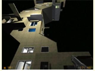
this was originally a map of my street.. I then stuck the houses into each other to make it more interesting. I have more maps here.. http://www.thenexusproject.co.uk/halflifemaps/

20 Comments

Commented 17 years ago2007-07-30 05:45:22 UTC Comment #15455
Again another very unusual map from Buud and again a must download.
Commented 17 years ago2007-07-30 07:32:34 UTC Comment #15458
Either you made another account or it's your friend.
Anyhow, it's rated unfairly. This map is no way deserving of a 5.
Commented 17 years ago2007-07-30 13:51:09 UTC Comment #15461
seconded
Commented 17 years ago2007-07-30 14:09:45 UTC Comment #15462
that would b fun
Commented 17 years ago2007-07-30 18:35:16 UTC Comment #15464
Weird map. I quite liked it.
-Stretched textures
-Boring lighting
+ok/interesting Architecture
-Weapon placement
-Gameplay

Since weapon placement seems pretty random and cheap it probably would make a bad gameplay.
Commented 17 years ago2007-07-31 00:30:38 UTC Comment #15465
Spam comment = 1 Star
Commented 17 years ago2007-07-31 04:56:05 UTC Comment #15467
I think we should reserve judgement on whether or not he rated his own map until an IP check has been done.

The map looks fairly interesting, though.
Commented 17 years ago2007-07-31 05:25:16 UTC Comment #15468
Remember everyone.. its just for fun. Put it into perspective.. We're making halflife 1 maps here... Not CGI for the movies.
Commented 17 years ago2007-07-31 08:48:55 UTC Comment #15470
Again rating your own map...
Commented 17 years ago2007-07-31 10:57:44 UTC Comment #15476
Strider, you've got to be kidding. Even if it's someone else, this person has rated each of these maps before any download. The comment comes like 2 seconds after the map has been submitted. All circumstantial evidence points to self rating & self commenting.
Commented 17 years ago2007-07-31 10:59:44 UTC Comment #15477
Budd: No one expects Hollywood CGI, but you can still use Half-Life's capabilities creatively to make your maps look nice. Here I just see a blocky Dr.Seuss building in blackness. Fun maps can looks good. But this doesn't even seem fun.
Commented 17 years ago2007-07-31 21:13:30 UTC Comment #15485
Dave: All 'evidence' points to his mate rating it. And if it's his mate that's rating his maps, there's nothing we can do about that. It's not all that different from self-rating, it's a litte cheap, but it still ISN'T self-rating.
Commented 17 years ago2007-07-31 21:56:39 UTC Comment #15487
Isn't slapping a 5-star rating & gloating comment on your friends maps spam?
Commented 17 years ago2007-08-01 22:32:50 UTC Comment #15491
buud look at some 5 star maps some of the regs voted

i aint voting because i hate ammo-nx

dont know him
hate him
Commented 17 years ago2007-08-02 15:02:42 UTC Comment #15492
They're not the same person. IPs don't lie, so quit bitching about his friend giving him a high rating. :/

As for the map - it's far from perfect, though I kind of liked it.

The architecture was mostly clean-ish and average, but EXTREMELY undetailed. The theme being surreal provides you with tons of choices to spice things up in an original and weird way. Didn't see any of that inside the building. Texturing was very dull and wasn't anywhere near surrealistic. Same problem with lighting.
Another thing, that you've overlooked was ambience. Some weird sounds would've been great.
About the gameplay and layout - it's pretty interesting, though as Sajo said, the weapon placement was random. That's a very bad idea for a map with one main battle area, since it makes the map look more like a killbox. The r_speeds were a bit high in the bottom/top of the map, though it's still playable.
Still - making a killbox look like a decent map isn't easy and you've accomplished that quite well. :>
I'd give 2.5 stars, since it's very lacking, but let's make that a 3. Work harder on visuals and the atmosphere and you'll have yourself quite an original and fun map.
Commented 17 years ago2007-08-05 01:23:14 UTC Comment #15499
If you have multiple computers, or visit a friends house/library, it would be very easy to have a different IP.
Commented 17 years ago2007-08-05 14:08:08 UTC Comment #15504
Again here... unfair ratings, rate the MAP don't rate the previous comments.

What have you guys got against him?
Commented 17 years ago2007-08-06 04:12:03 UTC Comment #15514
I like the layout of this map, make it larger or get rid of the black and add scenery, better texturing and add some fun stuff like secrets and traps. This kind of map is begging for some. I having a friend rate 5 stars is a bit cheap but dragging his map down with 1 star ratings just to drop the 5 star rating is rather bad. You should have done that THEN rate it properly based on the actual map. We are supposed to be rating the map after all and not the person! This map could be much better, I recommend working on it.
Commented 17 years ago2007-08-18 20:05:11 UTC Comment #15568
Everyone talking "SPAM" this spam that. Young idiots. Either ya like the damned map or ya don't, be positive. Not ignorant.
Commented 10 years ago2014-04-09 10:05:06 UTC Comment #20506
this is multiplayer.

You must log in to post a comment. You can login or register a new account.