ka_project
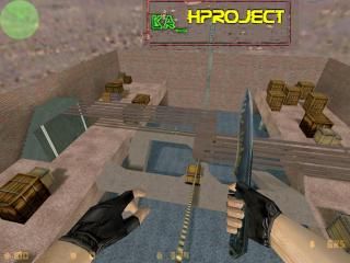
The ka_H project. A little(not that little!) knife arena map i made it due to a competition here in romania.I hope you'd like it.32 players.30-35 HP. Knife only. Water below so you wouldn't die if you fall of from the paths.Happy play.
9 Comments
You must log in to post a comment. You can login or register a new account.

 CS
CS


The shadows on the water look nice, I'll give you that.
And the brushwork is the best I've seen you do so far.
But you still have a lot to learn. There are many things about this map that still scream "beginner!"
I'll give this 3 stars to encourage you. Mainly because of those water shadows. I liked those!
But you're a million miles away from 4 stars
Keep practicing. You are getting better.
First of all: Do NOT surround your map with a simple single-textrued box. I know, that this is a knife map, and that realism doesn't play the main role here, but it sure adds a lot to your map, if you have something more realistic to surround your map. Maybe some streets, high-rise buildings or even some surreal flowing thingys for all I care, but at least have SOMETHING to have the illusion, that you're are somewhere, not just flowing around in a mindless blank void.
Secondly: The lights. They are just too bright. If you're adding some environment lights to your map, you should pay attention not to make it too bright. Or even if you do so, you should have some more map elements on the top of your map, to cast some neat shadows on the ground. Play with different angles and brightness levels, to have the best effect. Those wooden planks were a nice touch, and made nice shadows, but there was just not enogh detail in the whole map to be all in all aesthetical.
Usual fy-cs stuff: Try to think of other places to take cover besides the damn wooden crates. Try to come up with a theme for a map (in case of cs: helicopter crash, demolished city, or something like that) and add objects to the map, which can logically be there. (Like: pieces of the helicopter, rocks, dirty, damaged walls, etc.)
Textures: Align!! The stairs just looked awful with the same pattern on them. When you're making stairs, make sure you dont have the same pattern on them, especially if you work with textures, which are not maint to be used for stairs in the first place. The wooden plank on the very top had also aligning problems. It's nice, that you aligned the top of the plank, but the players can also see the bottom! So, you should align everything, what the player can see.
By the way, you should also experiment, which textures look good together. These don't. Or, you could add some thin brushes on the sides (with the same tetxture), to have them come together somehow.
And last but not least: Put more effort and more time into your maps, before you upload them. I always work at least like 20-25 hours on a map, before I load it up, and even then, they don't look perfect at all. Again, I know this is CS and FY and KNIFE and stuff like that, which are often just for the lulz, but you should really take more time, and fuck around more with your maps. Add some nice detalis, some ambience, some mood. Do not submit some put-together-in-three-hours maps at TWHL please.
You're a beginner, getting better, and having motivation, as said earlier. Please try to follow some of these advices plz, before you submit a map.
Thanks for reading, and good night.
I know I'm talking on a site dedicated to mapping so here I should be more careful to the quality of my maps.But on sites were you only upload a map and Aurevoir ,you could upload even stupid maps. I,personally ,like those maps.I like to see what other people created.But there are some maps played wich are extremely simple.For example: 1HP , aim_bycastor and so.And they are well-played .And I realy don't see on servers the mega-maps( I call them like this
K i finished with this crap. Thanks for the advises.Have a nice day!(play!)