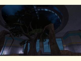
compo24_deathan
 CS
CS
compo24_deathan
by
Deathan
Posted 17 years ago2007-11-12 17:29:37 UTC •
Completed •
Counter-Strike
- Name
- compo24_deathan
- By
-
 Deathan
 - Type
- Map
- Engine
- Goldsource
- Game
- Counter-Strike
- Category
- Completed
- Included
- BSP
- Created
- 17 years ago2007-11-12 17:29:37 UTC
- Updated
- 17 years ago2007-11-13 11:57:42 UTC
- Views
- 2831
- Downloads
- 1247
- Comments
- 7
- Rating
- 4.75 (4)
- Reviews
- 0
Map for competition.
Mod Edit: Updated downloadlink with Rimrooks link.
Mod Edit: Updated downloadlink with Rimrooks link.
7 Comments
You must log in to post a comment. You can login or register a new account.


http://m0px.net/rimrook/compo24_deathan.zip
I'll rate it 1 to 5 when I get home.
+ great idea
+ stuck to the layout retardedly well
= Every light is a lamp, no light fixtures?
= Some dodgey clipping
- Silent map, no ambient sounds. Kinda nubbish for a compo map
Overall, very impressive! given the complexity of the layout.
The lack of much sound was a bit disappointing but it would be less noticable if people were actually fighting on the map.
The clips were understandable, but being stopped by an invisible wall is always a bit irritating, no matter how justified it might be.
I gave dm_particle 5 stars and this is just as good, if not better, so 5 stars for this as well.
when I saw it. It's all beautiful !! The only missing thing is...well....the sound
-The power generators aren't that obvious. They need to look more important than a wall-mounted breaker box. After all, this is THE LAST TREE in the world.
-The terrain at the end of the large retention pond. I find it particularly frustrating in any CS map when there's a clip brush placed across an open space. There needs to be a reason you can't walk off the compound, like a fence.
Again, this is really good work.